01 / SOULBOUND LABS
2026
ClawCraft
A managed AI agent you run by talking to it
Visit getclawcraft.com- FOR
- People who want what OpenClaw can do without running a server, a terminal and a stack of API keys to get it.
- ROLE
- Co-founder. Brand direction, art direction, graphic design and UX were all mine, and I built the 3D world, the front-end, the agent behaviour and the marketing materials.
- TEAM
- Two: me and my engineering co-founder.
- TIMELINE
- Three months.
- STATUS
- Private alpha, 2026.
- STACK
- React, TypeScript, Vite, TanStack Router, Tailwind v4, Convex, React Three Fiber, Motion, i18next. Agents run in isolated containers on GKE Autopilot.
Impact
PRIVATE ALPHA, 2026
The people who saw it work were the ones who trusted it further.
THE NUMBER THAT TESTS THE ARGUMENT
18%
widened the agent's permissions themselves, without being asked
Autonomy as a gradient people climb when they are ready, rather than a setting you ask them to accept. Nobody was prompted to widen anything, so this is the only figure here that tests it.
PRIVATE ALPHA, 220 PEOPLE
220
signed up to the private alpha
Scale rather than traction.
42%
finished a real task in session one
The onboarding conversation delivering work instead of explaining it.
READ AGAINST ACTIVATION
At 220 people these are directional rather than statistical. Read against activation instead of signups: of the people who finished a real task, close to half went on to give the agent more room. Seeing it work came before trusting it further, which is the sequence the whole design assumes.
Introduction
ClawCraft is a managed AI agent you run by talking to it. No terminal, no API keys, no self-hosting. It reads your mail, keeps notes you can open, builds and publishes small sites, and works while you are not watching.
I co-founded it and designed all of it: the brand, the 3D world, the interface, the agent's behaviour, and the marketing. It ran in private alpha through 2026, shipping weekly.
Problem statement
People wanted what a self-hosted agent like OpenClaw can do, without running a server, a terminal and a stack of API keys. And an agent that can act on your behalf is frightening before it is useful: the design had to make an unpredictable system legible enough to trust.
An agent is nondeterministic, and conventional product design assumes predictable states. A button does the same thing every time. An agent decides what to do, takes minutes to do it, and sometimes gets it wrong. No component library covers "shows you it might be wrong."
The capability is also the threat. People want this because it can act on their behalf: send email, spend credits, change files. Those are the same reasons to be afraid of it.
Who it turned out to be for
We started by building for non-technical business owners, and it did not hold.
We spoke to business owners early, and the pattern was hard to miss. Every workflow was highly specific: its own tools, its own steps, its own exceptions. A general agent was never going to do all of those niche jobs well.
We tried anyway, for a while. Each conversation pulled the product in a new direction, and we kept finding ourselves building features because one customer needed them, not because the product did. That was the signal. When the roadmap is being written by whoever spoke to you last, you have a services business pretending to be a product.
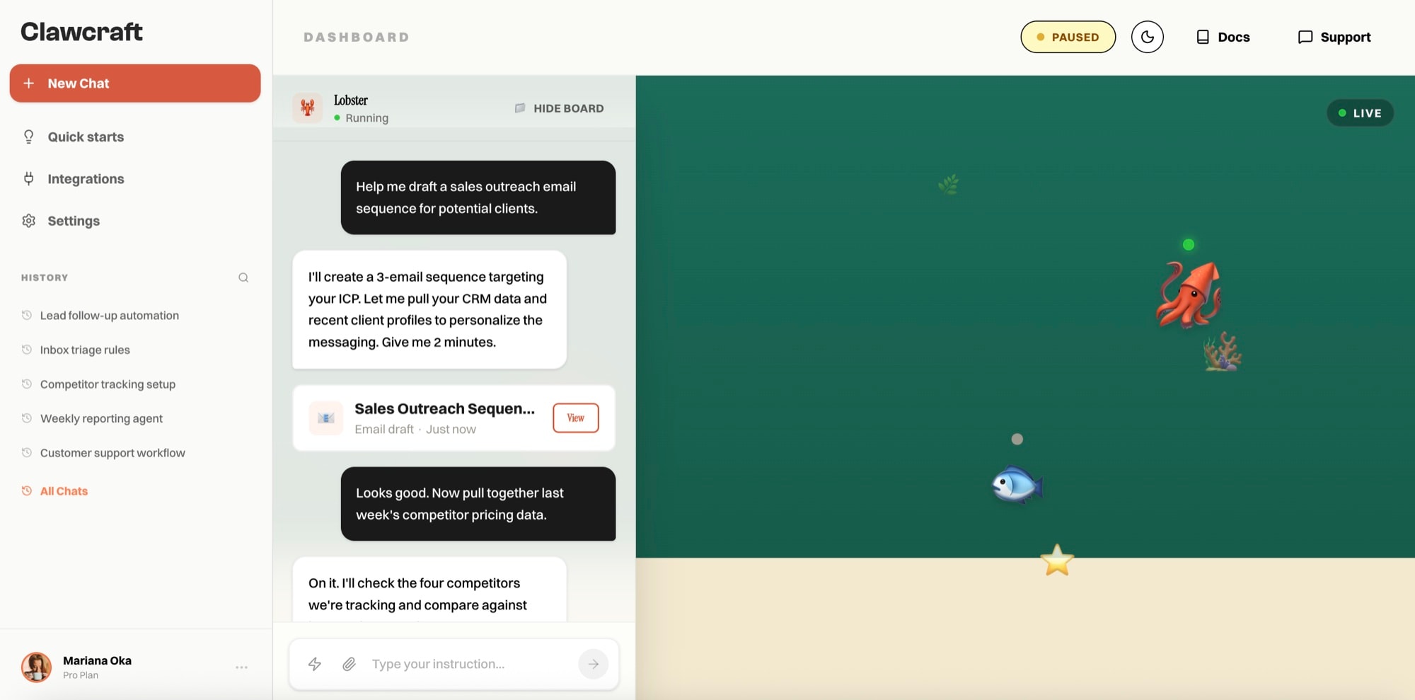
Testing showed the second problem. The workflow board on the right read as engineering tooling, and non-technical people found it intimidating. Underneath it, making a complex workflow run flawlessly on the go, across very different use cases, was not a promise we could keep. So we removed the board and the workflows altogether, and let the conversation carry the work.
So we went general, on purpose. ClawCraft became a consumer platform for less technical tech enthusiasts: people who want what OpenClaw can do without opening a terminal, and who want an agent whose memory keeps growing with them instead of starting from zero every session. Plenty of them use it for work, but as themselves, not as a company's system. We don't claim it will run a business, and the product no longer implies it will.
Specifically: people who want what OpenClaw can do and do not have the bandwidth to run it. They want to try the newest models as they land, the Chinese labs' releases included, build and publish their own sites, and keep everything in one notebook at a fraction of what Notion costs. Self-hosting gets them all of that, after a server, a terminal, a key and a bill for every model provider, and a sandbox they have to trust themselves to have built correctly.
WHO IT IS FOR
The same stack either way. The decision was who carries it.
A general agent is a poor fit for a market that needs a specific outcome, and a good fit for a market that values general capability.
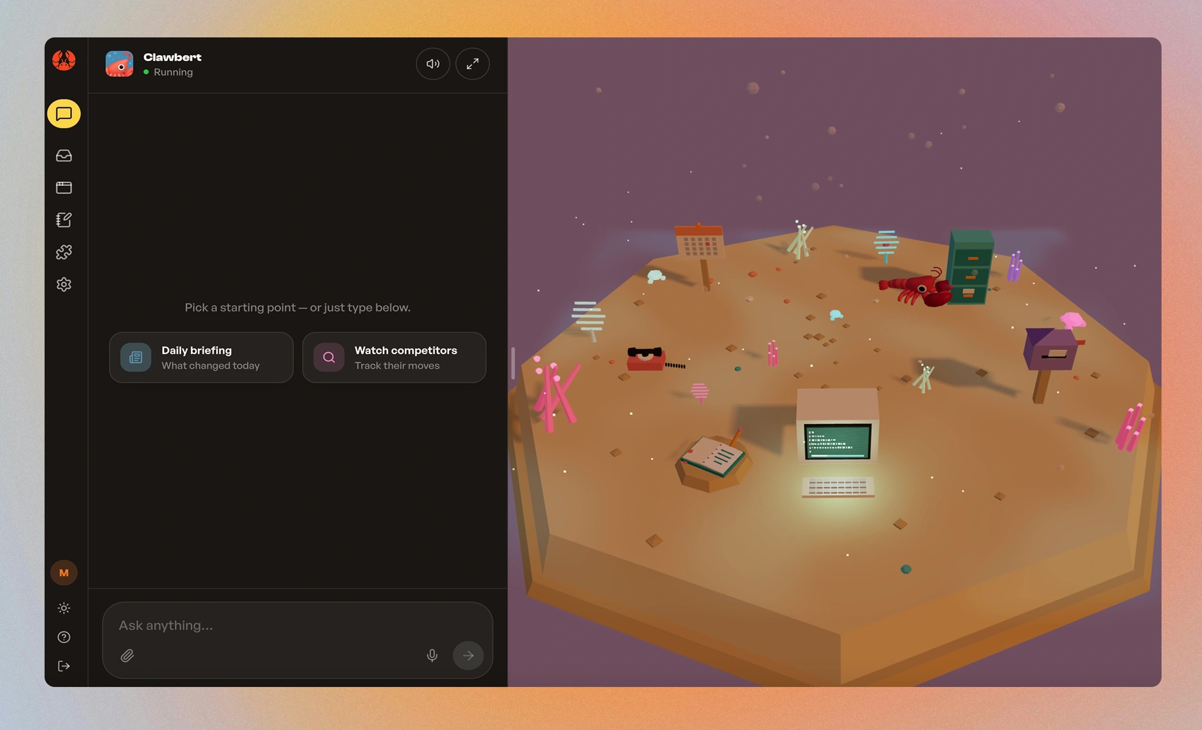
The same reasoning set the default theme. Dark is coded for a technical audience. It says this tool is for people who already know, which is the wrong opening line for a product whose premise is that you should not have to. Light is the default. Developers who want dark find it in the first session.
What I was trying to do
Make an unpredictable system legible enough to trust.
Concretely, that meant three things. Someone should be able to see what the agent can reach without reading a permissions page. They should be able to grant it more room at their own pace rather than at signup. And when it is wrong, they should find out from the interface rather than from the consequences.
What I looked at
Most agent products give you a chat box and a settings screen with forty tabs. You cannot tell what the thing is doing or what it can reach, and the permissions model is a form you fill in once and never see again.
The useful comparison was outside the category. Obsidian asks you to care about files, plugins and structure before you get value. Notion asks you to type. Our users could self-host an agent and cannot be bothered, which is the same taste. That decided the notebook.
The decisions
01A place, not a settings page
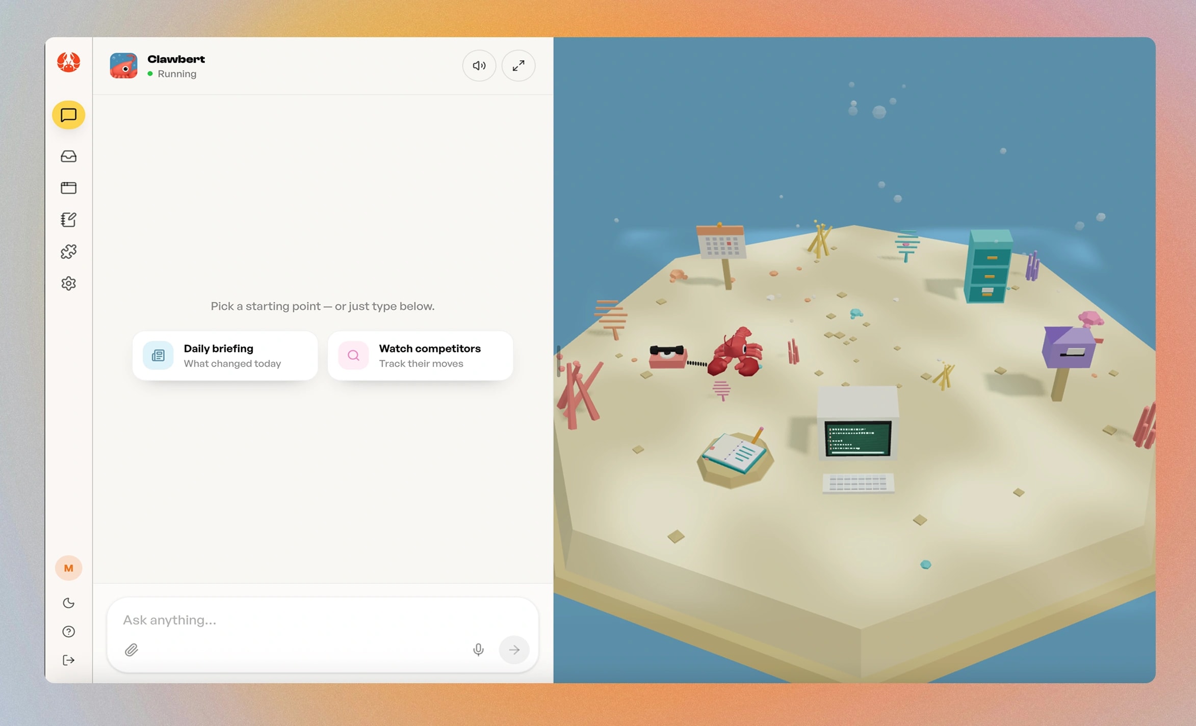
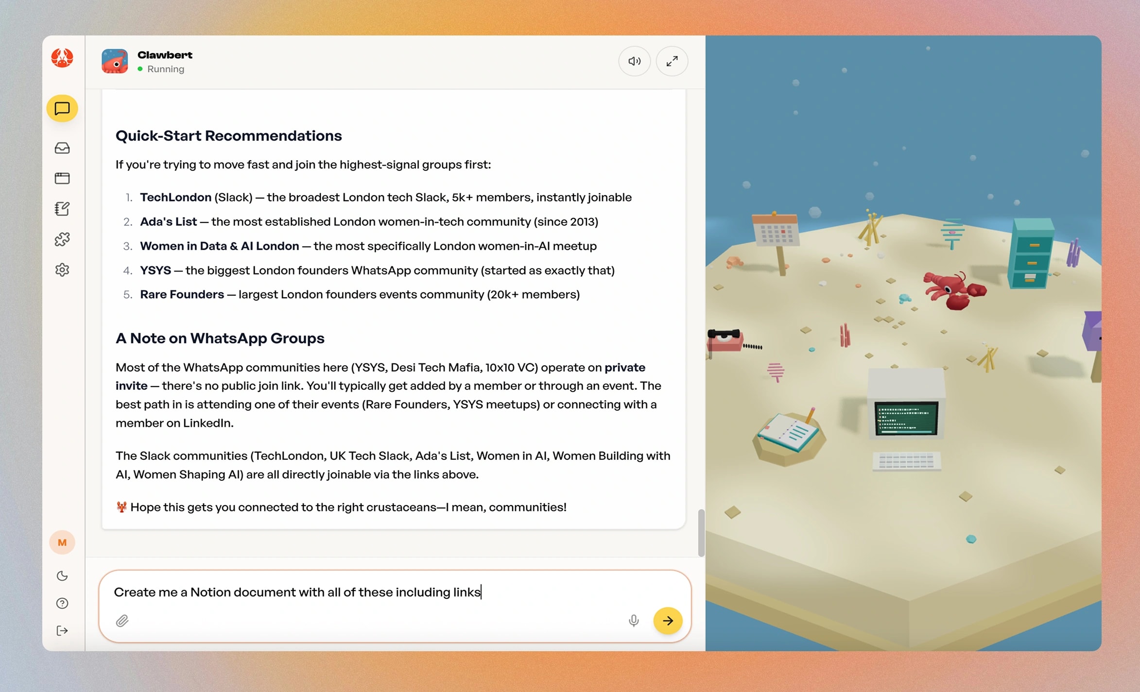
I built the agent a place instead of a settings screen. A small 3D island where every object is a real control. The mailbox is its inbox, the cabinet is your files, the notebook is the memory you share. Spatial memory holds better than menu memory: if you can point at where your agent's email lives, you understand its permissions without reading a permissions page.
Tapping an object opens a window deliberately smaller than the thing it points at. The inbox shows the last few messages and a button to the real one. You can see where things stand without leaving the world, and you cannot triage from there. A window capable enough to work in would have turned the island into a worse version of the app. They are styled as operating system windows on purpose. We are not building an app that contains an agent.
FIG 05 THE ISLAND, WITHOUT THE CHAT
A world for checking, next to a chat for asking.
In the product, the island sits beside the conversation. This recording isolates it, because the question it answers is narrow and easy to get wrong: how much of an application should a world expose? My answer was enough to check, never enough to work in.
Every object opens a window smaller than the tool it points at, and every window ends in one explicit way out to the full thing. Asking stays in the chat. The world is for glancing at what the agent has done, and for grabbing the one thing you came for.
Glance, then go deep.
The notebook opens as a window over the world, not a page change. A list, a note, a scroll, a close: the whole round trip happens without losing the island or the conversation beside it. Every window ends in Open in notebook, so depth is one deliberate step rather than a mode you fall into.
Proof that can leave the product.
The shortest path in the product ends at a public URL. The window lists what the agent built, previews a real site, and Copy puts its link on the clipboard. It's shareable before the full Studio is ever opened, because a link someone else can open is the one output that proves the agent did the work.
Names on demand, not on display.
Objects name themselves on hover and stay quiet otherwise. A world covered in labels is a settings page with scenery. Unlabelled, it runs on recognition: a mailbox reads as mail, a notebook as notes. The label is there for the moment recognition fails, not before it.
The same place at a different hour.
Switching theme doesn't recolour an interface; the island moves to dusk. Everything stays exactly where it was, so the spatial memory the whole design depends on survives the switch. Dark reads as a time of day in the same world, not a second product.
The chat is where you ask. The world is where you check. Keeping the world deliberately shallow is what stops either one becoming a worse copy of the other.
The first version centred the world in the viewport and let the chat panel sit over it. In a mockup that reads as correct, because a mockup shows you the whole canvas. In use the panel covered part of the island, and the parts it covered were controls. Early users found it for me by reaching for objects that were not on screen.
A centred composition and a centred usable area are not the same thing. The layout has to be measured against what is left once the interface is sitting on top of it.
We argued about dropping the world for weeks. It costs performance, and it puts off people who read whimsy as unserious. We took that trade knowingly: the people we build for find agents intimidating to set up, and a friendly place makes an argument about difficulty before a single feature is described. It also turned out to be the sticky part. Testers remembered ClawCraft over the other platforms they had tried, and the island was what they remembered.
02It starts locked down
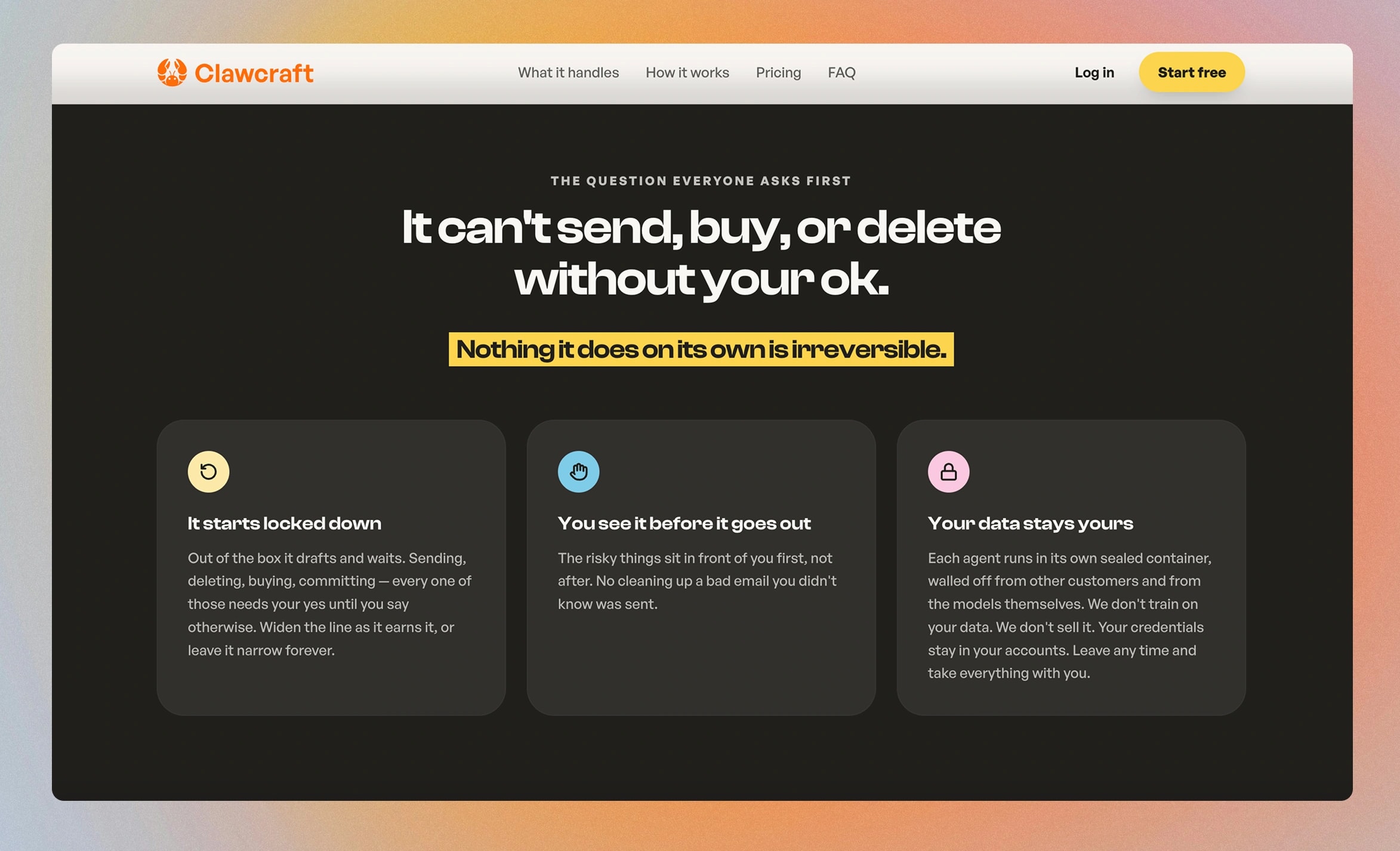
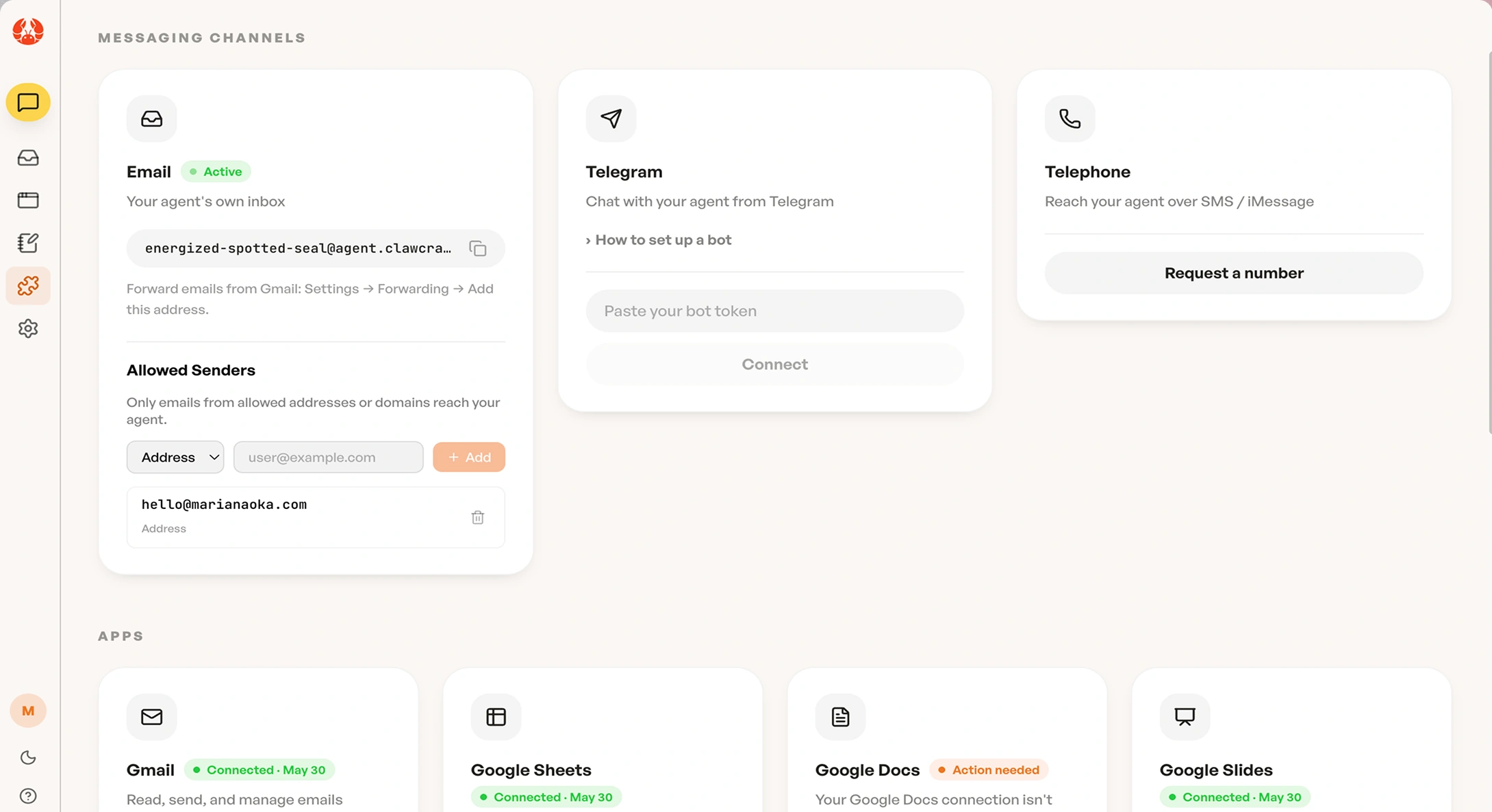
Out of the box the agent drafts and waits. Sending, deleting, buying and committing each require an explicit yes until you widen the line yourself. The most common question about an agent that can use your email is what stops it doing something you cannot undo. That needed a structural answer rather than reassuring copy.
The harder decision was where to explain it. In onboarding it landed as a manufactured moment, explaining a boundary before anything was at stake. I moved it to the instant you connect your inbox, which is when "can it now send email as me?" is actually on your mind.
Reassurance works at the point of hesitation, not before it.
03A notebook that behaves like Notion, not like Obsidian
The memory is a document you can open. Persistent memory is the obvious fix for an AI that forgets you between sessions, and hidden memory is worse than none, because you cannot tell what it thinks it knows.
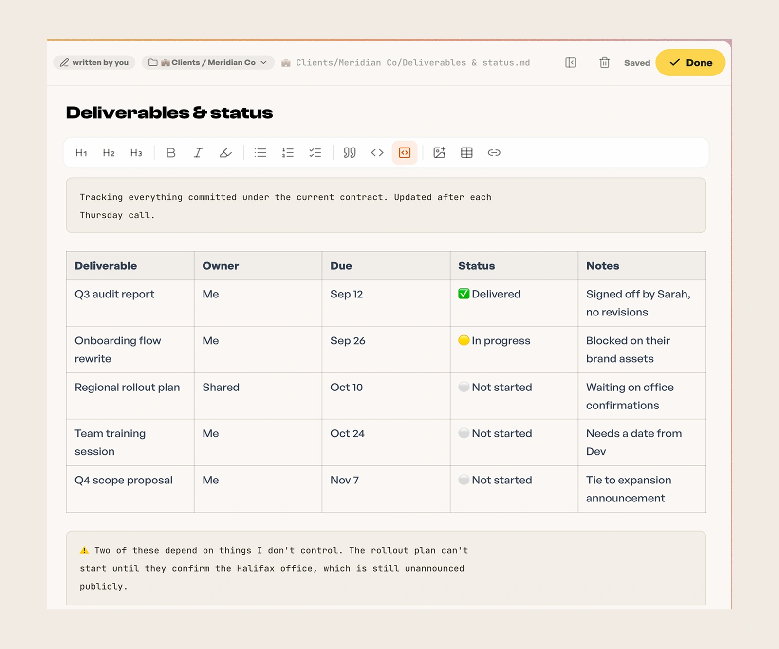
So the notebook opens like a page and never asks you to configure anything to start writing. It runs on TipTap with a markdown round-trip, so the file underneath stays plain text and stays yours. Sharing was a deliberate second move rather than a convenience. If a document can go out by link, the notebook stops being a memory viewer and becomes somewhere people write, and the agent gets better the more they use it for work they were doing anyway.
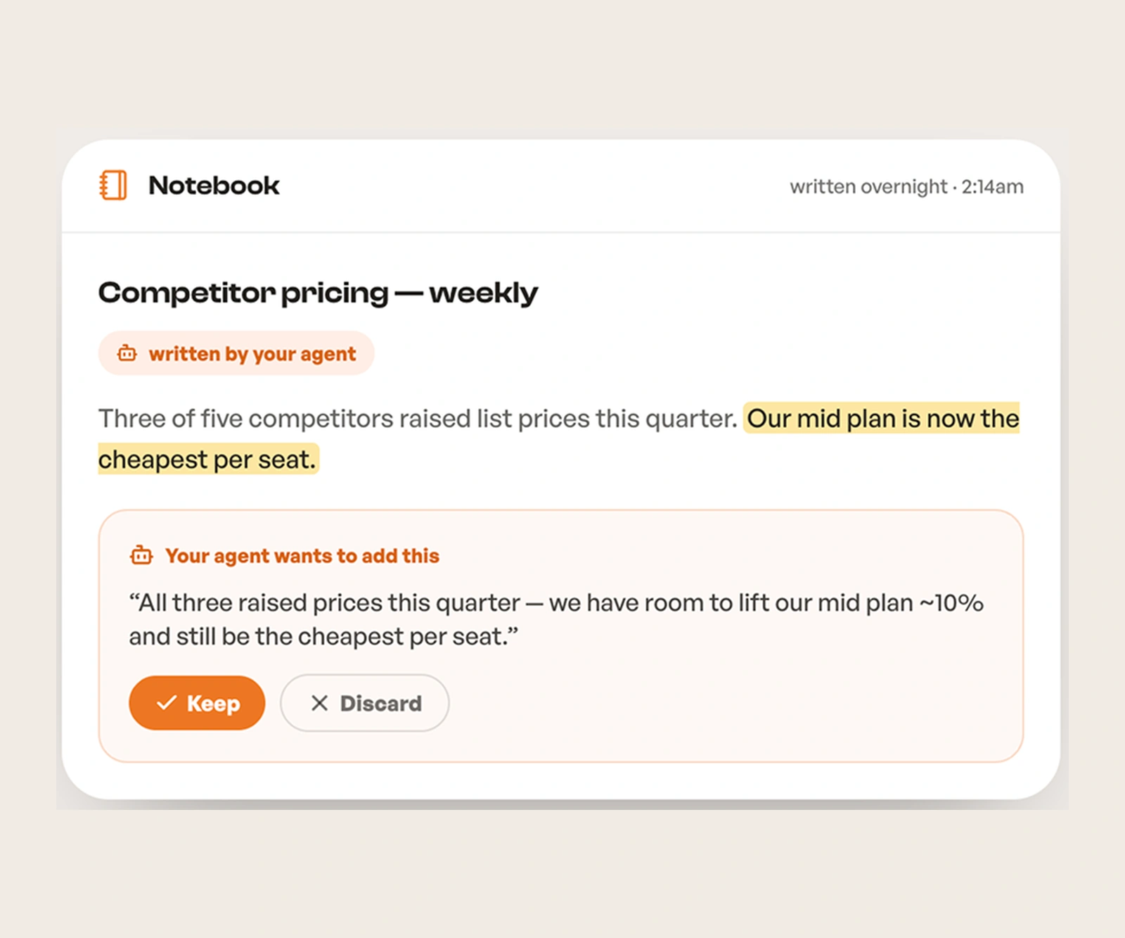
The interaction I care most about is that the agent does not quietly rewrite it. It proposes, and you Keep or Discard. Memory that changes without your knowledge is the thing people are afraid of.
FIG 09 THE NOTEBOOK, AND WHO WROTE WHAT
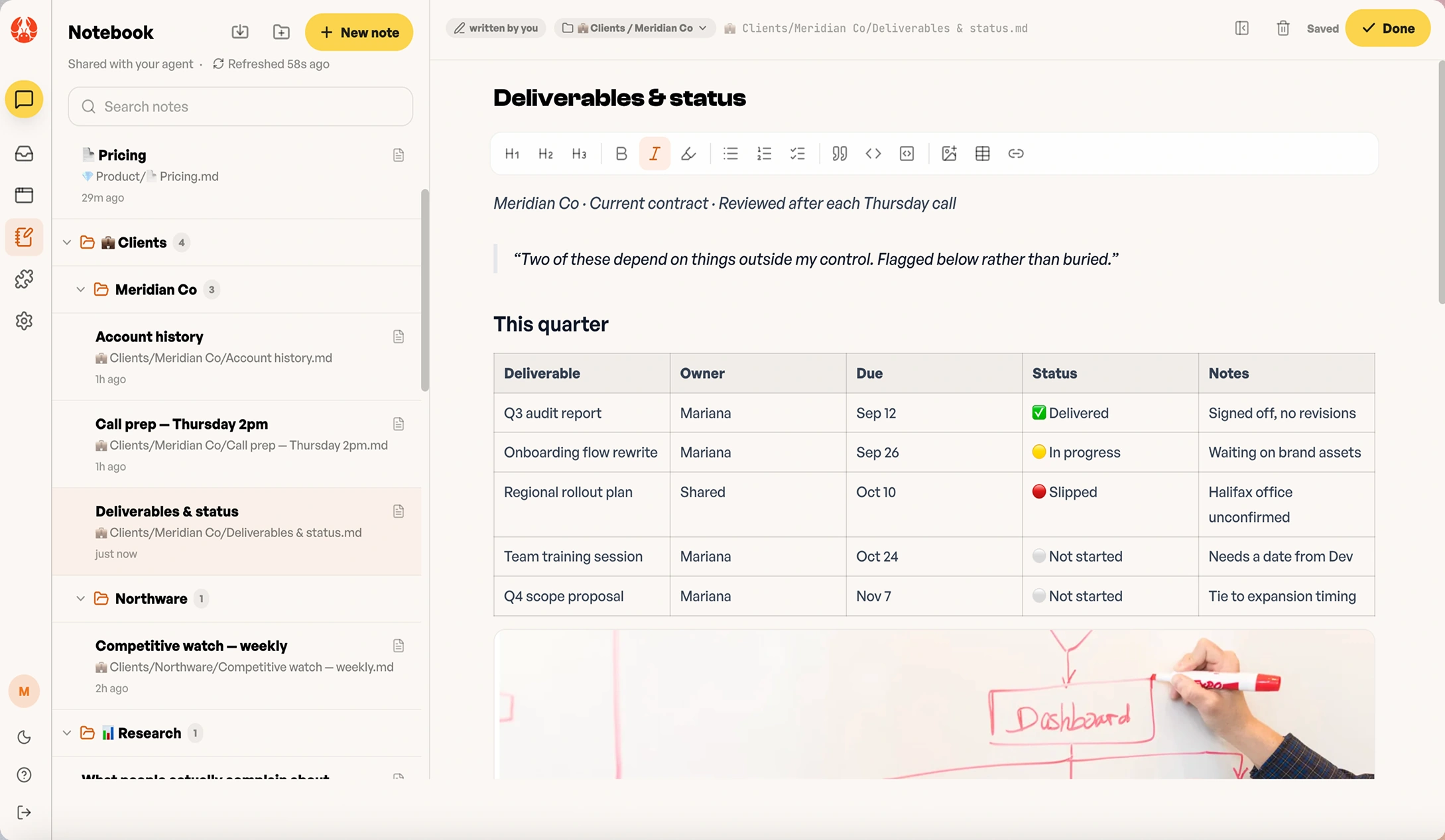
Memory the user can read, correct and publish.
Persistent memory is only an asset when its provenance is legible. A notebook an agent writes into invisibly is a liability the user can't audit. One they can read, edit and export is something they build on.
So every page says who wrote it, lives as a markdown file at a visible path, and becomes public only through an explicit step that can be reversed. Each state below is the same promise at a different moment.
The agent never edits silently. It proposes an addition in context, flagged as its own, and the page changes only when the user keeps it. Discard is one click and leaves no trace.
Provenance is a label on the page, not metadata in a panel. The file path is shown in full because the notebook is a folder of markdown underneath, and showing it is how the portability promise stays visible.
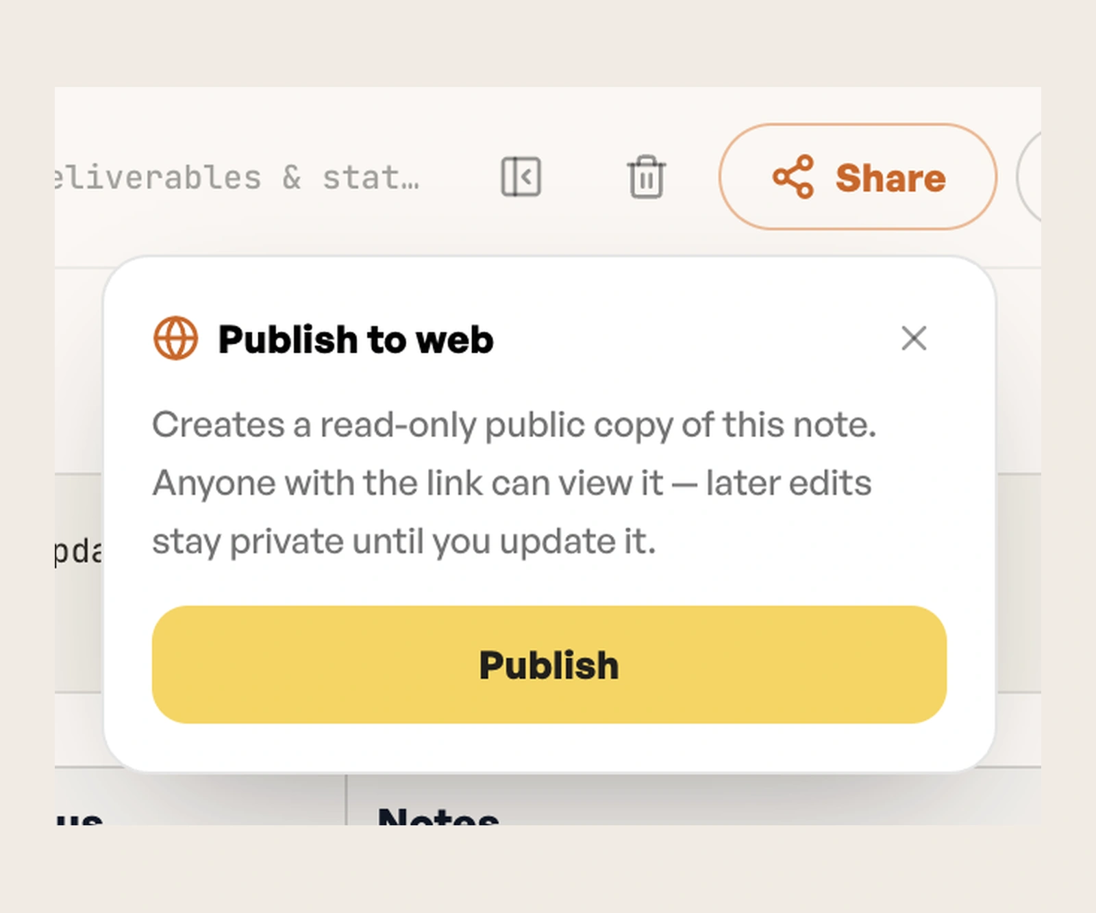
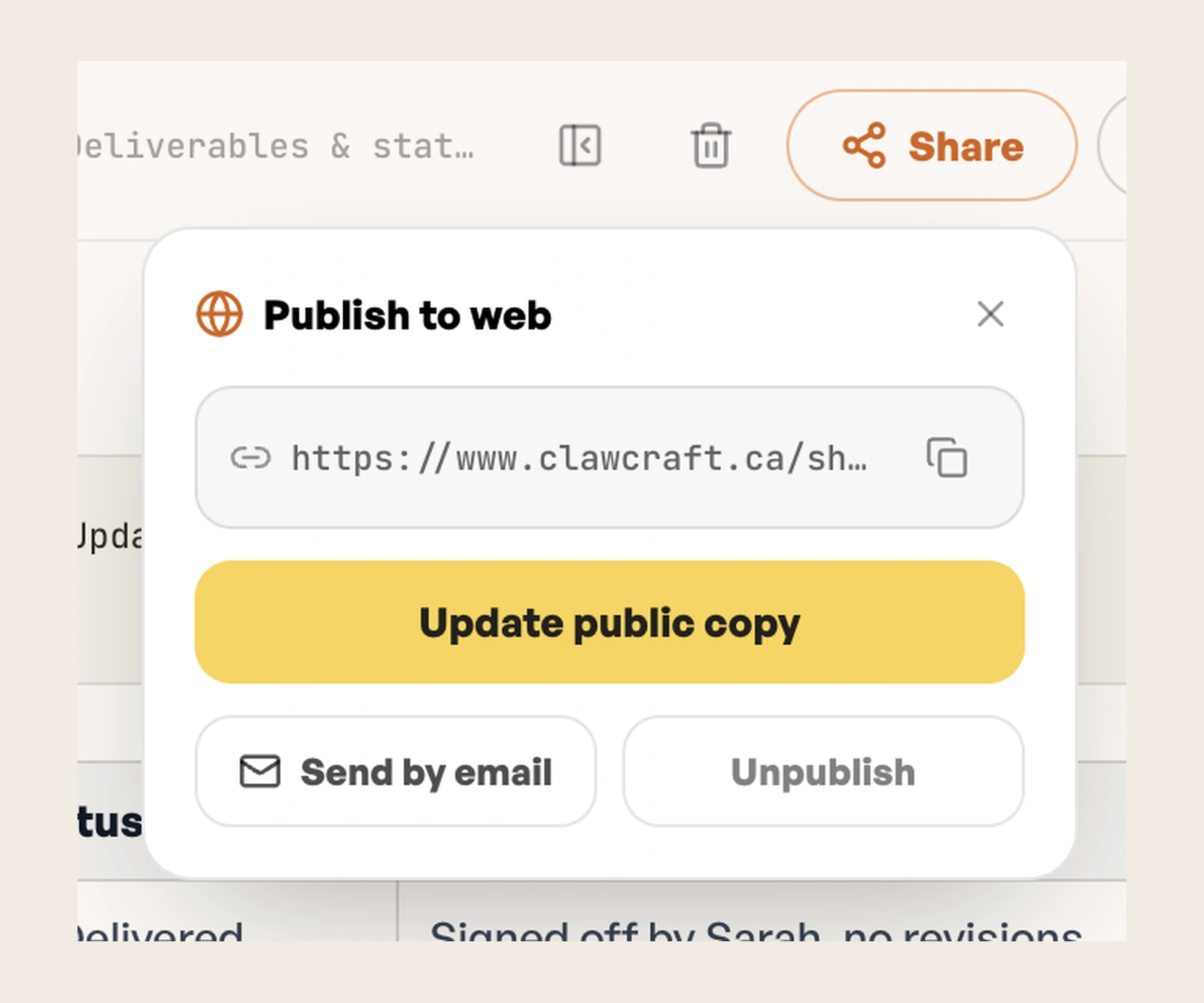
Publishing creates a read-only copy, and the dialog says exactly what that means before anything happens: later edits stay private until you choose to update it. The default protects the draft, not the audience.
Once public, the follow-on actions are the only three anyone needs: update the copy, send it, or take it down. Unpublishing sits beside sharing, at the same weight.
01 / 04 WRITTEN BY YOUR AGENT
Provenance on the page.
Written by you or written by your agent is a label, not a log. Trust in memory starts with knowing whose memory it is.
Proposals, not edits.
The agent's additions wait for Keep. Reviewing costs one click; a silent rewrite costs the whole notebook its credibility.
Public is a copy.
Publishing snapshots the page, so drafting never leaks, and taking it back is as easy as sharing it.
04Studio, because a link is the proof
Studio lets someone describe a site and get a real one, published at a public URL. No deployment, no terminal, no hosting account.
An agent that produces things you cannot show anyone has produced a description of work. A URL is the smallest artifact that survives leaving the app. It can be sent to someone who has never heard of ClawCraft, and it still works.
FIG 11 2 IMAGES, SWIPE OR USE THE ARROWS
01 / 02
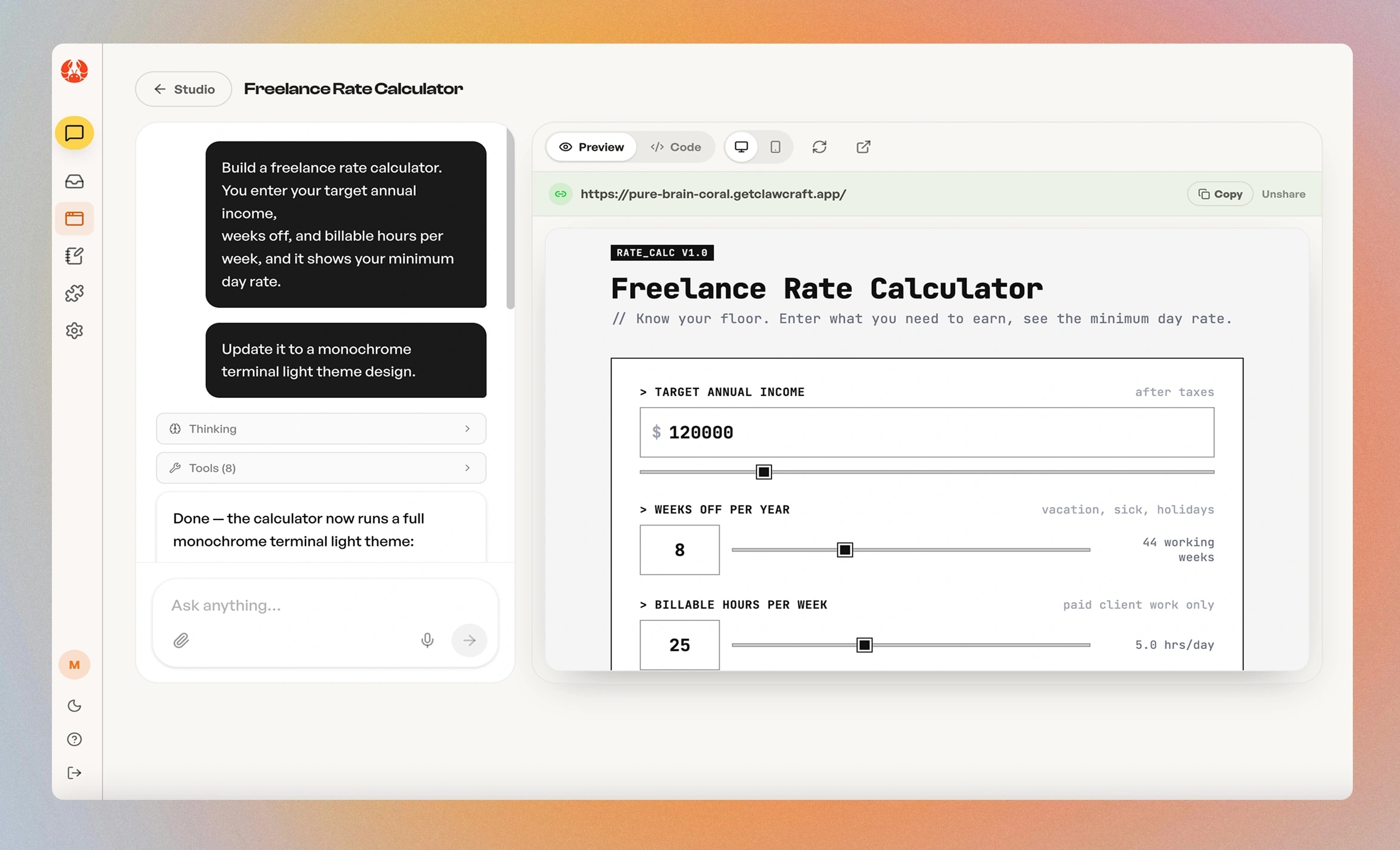
FIG 11ADescribed, then refined in plain language. The public address sits above the preview, with Copy beside it and Unshare one step away.
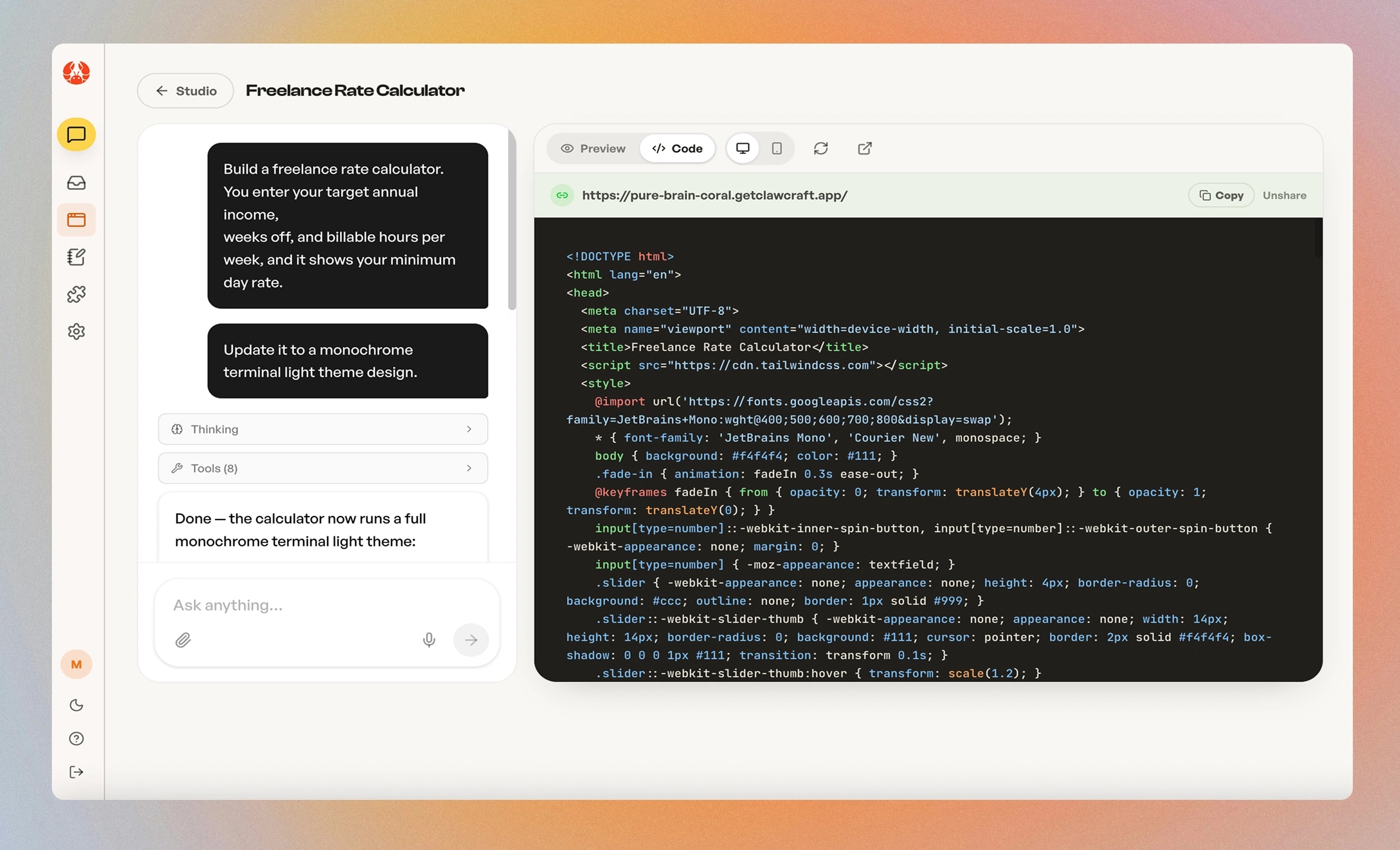
FIG 11BThe same site as code, one tab over. Nothing is hidden from people who can read it, and nobody is made to.
05Introductions, running in the background
While the agent is idle it can look for people worth knowing and bring them back to you. My co-founder suggested it and I was sceptical. It sits outside the tidy story of a to-do list that finishes itself, and it sounds impressive while delivering noise.
Testers changed my mind faster than any argument would have. What I designed around it was restraint. Introductions arrive as something you find later, not as an interruption, and they carry the reasoning for why this person came up. An agent that pings you with a stranger is a nuisance. An agent that leaves a note explaining why it thought of someone is doing what a good colleague does.
06Behaviour as an enforceable spec
We wanted the agent to read the user and adapt, and never push. That stays a wish until it is written as rules it can break:
- →Never punish brief answers with repeated questions.
- →No more than one playful line per two-message span.
- →If the user sounds formal, stressed, skeptical, rushed or hostile: become more neutral immediately.
- →Never be sycophantic. No "Great question!"
- →If the user is brief, be brief back.
And a skip contract, because the failure mode of a curious agent is a needy one:
- →Changing the subject counts as skipping. Follow them. Say nothing.
- →Never ask the same question twice, answered or not.
- →After two skips, stop asking this session.
- →Never react to a skip. No "no problem!", no retry, no nudge.
The rules about not speaking did more work than the rules about how to speak. The skip contract came out of testing: people wanted to get working rather than answer questions, and the agent's curiosity was becoming a blocker.
07The agent onboards itself
The product shipped with a three-step welcome modal and four starter chips containing literal placeholders the user had to fill in. The first experience of an agent that does work for you was doing some work.
I replaced it with a conversation the agent runs. It speaks first, asks one question, then delivers a real piece of work before asking for anything else.
Craft
The notebook card is marked written overnight, 2:14am. The introduction email is timestamped 6:04am. Neither is explained. Together they say the agent works while you sleep, and you wake up to what it found.
Clawbert, and why a character at all
An agent that can send email on your behalf is, before anything else, a source of anxiety. Clawbert is the design's answer to that anxiety first and its mascot second.
The research is consistent about the mechanism. People apply social rules to software whether or not it was designed for them (Reeves and Nass, The Media Equation, 1996), so an agent gets read as a character either way. The only choice is whether that character is designed. Given a name, a face and a voice, people trust an autonomous system more and blame it less when something goes wrong (Waytz, Heafner and Epley, 2014, studying self-driving cars). And the presence of a lifelike character improves how people perceive an experience even when it adds no function of its own, the persona effect (Lester and colleagues, 1997).
He is a stylised lobster rather than a human avatar, for two reasons. A non-human character sidesteps the uncanny valley (Mori, 1970), where a face that is almost human reads as unsettling rather than warm. And a lobster makes no claim to intelligence it can't back up. Nobody expects a crustacean to be infallible, which is the right expectation to set for a system that will sometimes be wrong.
The cautionary case is Clippy. Microsoft's Office Assistant had a character and broke every social rule that character implied: it interrupted, it presumed, and it couldn't take a hint. Charm amplifies behaviour in both directions, which is why Clawbert's rules were written before his lines.
Poke him and he answers. The obvious version is a Tamagotchi, a creature that wants attention and sulks without it, which is exactly the wrong animal for this product. Every line he has says the same thing: it's handled, nothing needs you, go do something else. A mascot that needs you contradicts the premise, so his personality is spent on being low-maintenance rather than endearing.
The payoff is memory. In testing, the island was what people remembered about ClawCraft over the other agent platforms they had tried, and Clawbert is who lives there. A character gives a product something to be recalled by, and being recalled is where coming back starts.
Friendliness lowers the cost of trying. Being low-maintenance is what makes it worth staying.
The brand and the site
Brand direction, art direction, graphic design and UX were all mine, from the lobster to the landing page. The site makes three promises, and each is one the product already keeps structurally: it works while you're away, nothing it does on its own is irreversible, and what it learns stays yours as plain files you can export. Marketing that restates the product's constraints is marketing nobody can catch out.
FIG 14 ONE SYSTEM, SITE AND PRODUCT
Fun, but grown up. One palette and one type scale from the landing page to the app.
Cream
The canvas. Cream and ink do most of the work, so colour stays rationed.
Ink
Type, and every control that isn't the main action.
Terracotta
Reserved for Clawbert and the wordmark, and the in-app accent, so signing in never feels like a different company.
Yellow
Action: Start free, the highlighted line the agent wrote, Keep.
Espresso #1A1613
The dark mode base, warm, with neutral grey panels so cards read clean rather than dusky.
Candy #F285C1
One of five flat accents, with periwinkle, sky, blush and butter. Decoration only.
Sky #7ECBE8
Flat accent. Colour never carries meaning on its own.
CLASH DISPLAY, THE VOICE
Hand it the work.
Headings and display, in two tiers: pillars for the value propositions, utility for How it works and the FAQ. Before this, every section shared one size and a skimmer got no ranking signal anywhere.
GENERAL SANS, THE INTERFACE
It keeps what it learns.
Body, UI and the wordmark. Set at weight 500 so long copy never reads thin, and it carries across the site and the app unchanged.
FIG 15 3 IMAGES, SWIPE OR USE THE ARROWS
01 / 03
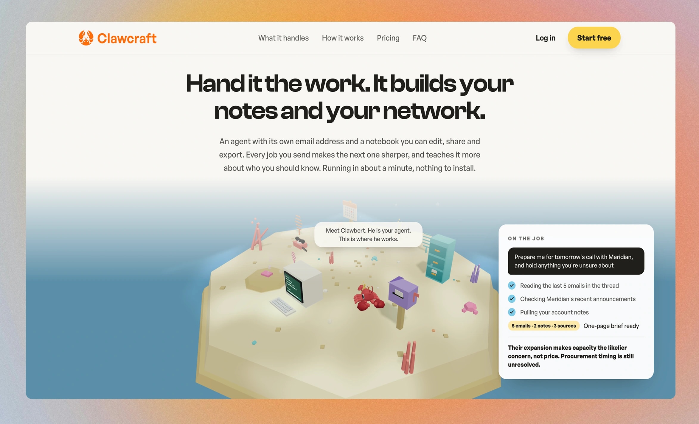
FIG 15AThe island is on the landing page because it is the product, not an illustration of it. The side card shows a job in progress: what it read, and what it's still unsure about.
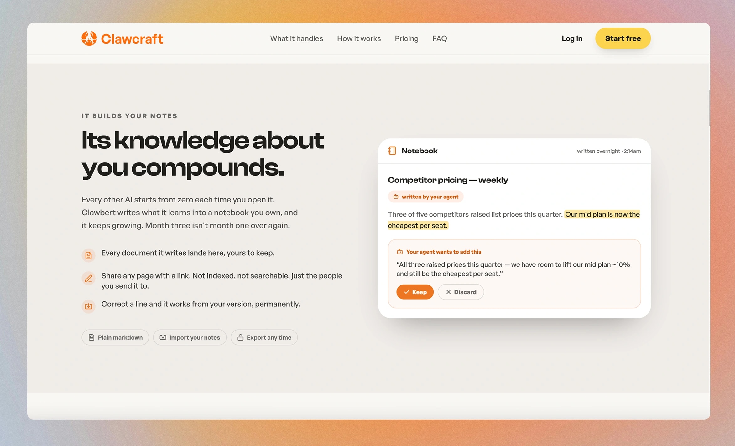
FIG 15BThe notebook, sold on the interaction that makes it trustworthy: the agent proposes, you keep or discard.
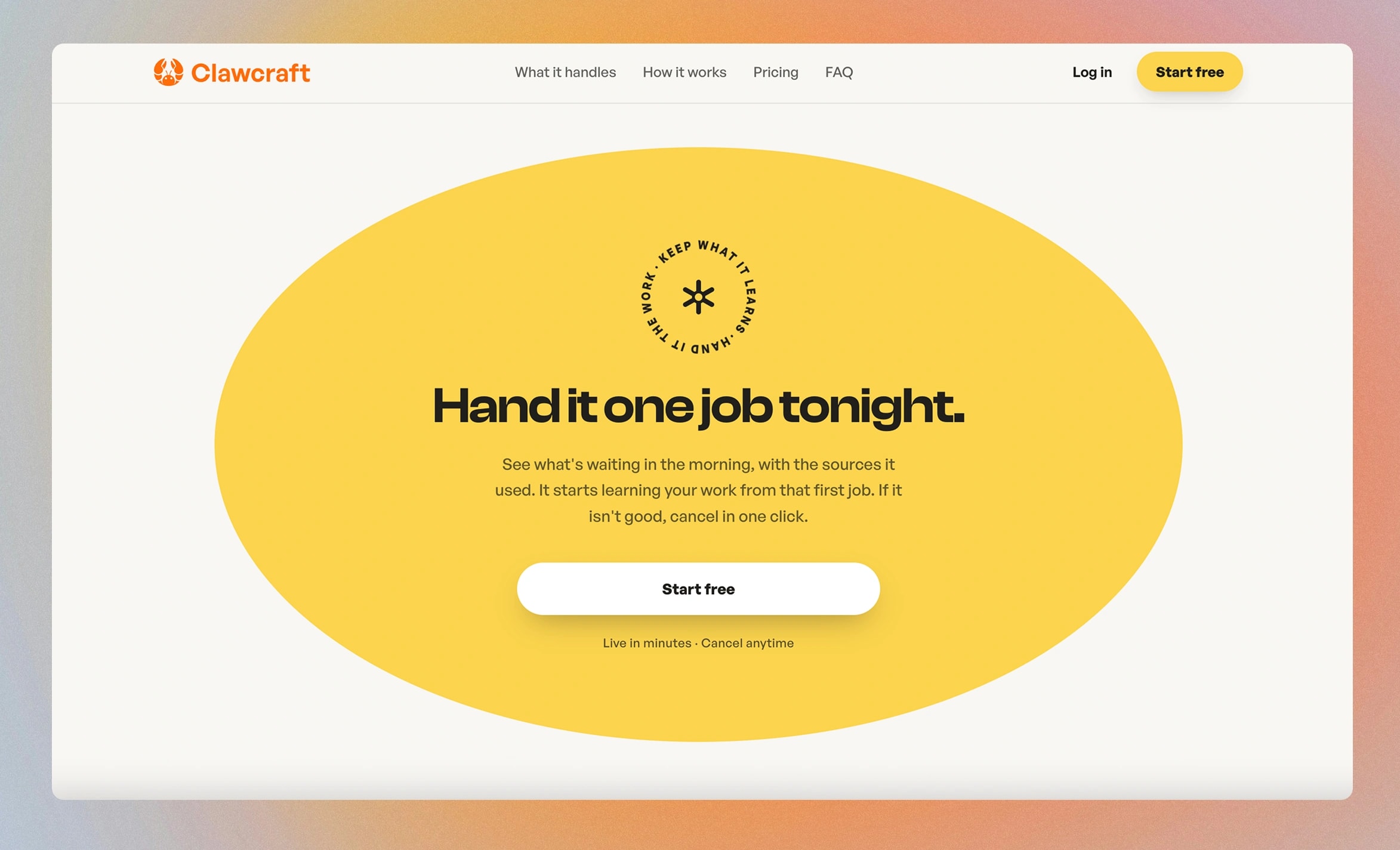
FIG 15CThe close. One job tonight, results in the morning with sources, cancel in one click. The offer is sized to the trust a stranger can extend.
What I would do differently
We built a ten-step bookshop workflow before confirming that business owners were the right market. Five structured conversations with a checklist of their workflows would have shown the pattern before we wrote any code.
Reflection
Character in an agent is a set of rules it can violate, not a tone document. Anything unenforceable is decoration.
Trust gets explained at the point of hesitation. Onboarding is the worst place to reassure someone about a risk they have not felt yet.
The expensive, arguable decisions were the memorable ones. The 3D world was the hardest thing to justify and the thing people remember. Introductions were the feature I would have cut on taste, and testers were right about it before I was.