05 / PINATA
2023 to 2024
Pinata
Cutting support tickets 60% on a product its users had outgrown
- FOR
- Web3 developers storing and serving media on IPFS, many of them managing thousands of files.
- ROLE
- Sole product designer. Research, UX writing, IA, UI, the design system, and QA on the build.
- TEAM
- Two senior engineers, one PM, distributed across time zones.
- TIMELINE
- Two and a half months.
- TOOLS
- Figma, FullStory, Userbrain, Intercom, Retool, Slack.
- OUTCOME
- Support tickets down 60%, measured in Intercom. Development 70% faster once the component library was in place.
Impact
SHIPPED
Fewer tickets for the people using it. Faster shipping for the people building it.
FOR THE PEOPLE USING IT
60%
fewer support tickets after the UX updates
MEASURED IN INTERCOM
70%
faster development
For the people building it, once reusable components were in place.
~80
interactions audited
Every one annotated and severity-rated.
15+
interface updates shipped
Across the platform rebuild.
SHIPPED
- 01Analytics, with usage attributed to files and referrers
- 02Spend limits the customer sets
- 03Bulk operations and search
- 04Workspaces
- 05A component library and documentation, adopted across surfaces
TWO HALVES OF ONE JOB
The 60% is what changed for the people using the product. The 70% is what changed for the people building it. A design hire is usually asked to move one of those, and it is worth being able to show both.
Background
Pinata stores and retrieves media on IPFS for web3 developers. Support tickets were climbing and engagement was falling, and the easy read was that the UI was confusing.
The tickets said otherwise. Some users were arriving at bills over three thousand dollars a month with no idea what had produced them. Pricing is usage-based, so the bill is a consequence of behaviour the product was not showing anyone. That is not a billing problem. It is a product that had stopped being legible to the people paying for it.
Underneath it was a maturity problem. Early users managed a handful of files. By then developers were managing thousands, and the product still assumed one-at-a-time operations. Every friction point compounded with scale.
Users could not see what they were spending, could not cap it, and could not clean it up. One problem with three faces, and the bill was where all three arrived at once.
ONE PROBLEM, THREE FACES
Fix the gaps upstream and the bill has nothing left to surprise anyone with.
That reframing changed the brief. A usability problem gets you a visual refresh. This got analytics, spend controls, batch operations and a design system.
The research paired what people said with what they did. On the attitudinal side, the ticket queue and more than 200 survey responses through Intercom. On the behavioural side, 25 remote usability tests on Userbrain, with participants recruited from the product's Twitter and Discord, and more than 50 rage clicks traced through FullStory session recordings. Targets were set before any design work, and tracked in FullStory and Retool: churn down 20%, satisfaction up 30%, time to complete onboarding halved, and half of active accounts using the analytics dashboard.
Problem statement
Developers were hitting surprise bills of over three thousand dollars on a product they had outgrown. They could not see what they were spending, could not cap it, and could not clean it up.
The decisions
01Audit every interaction, not a sample
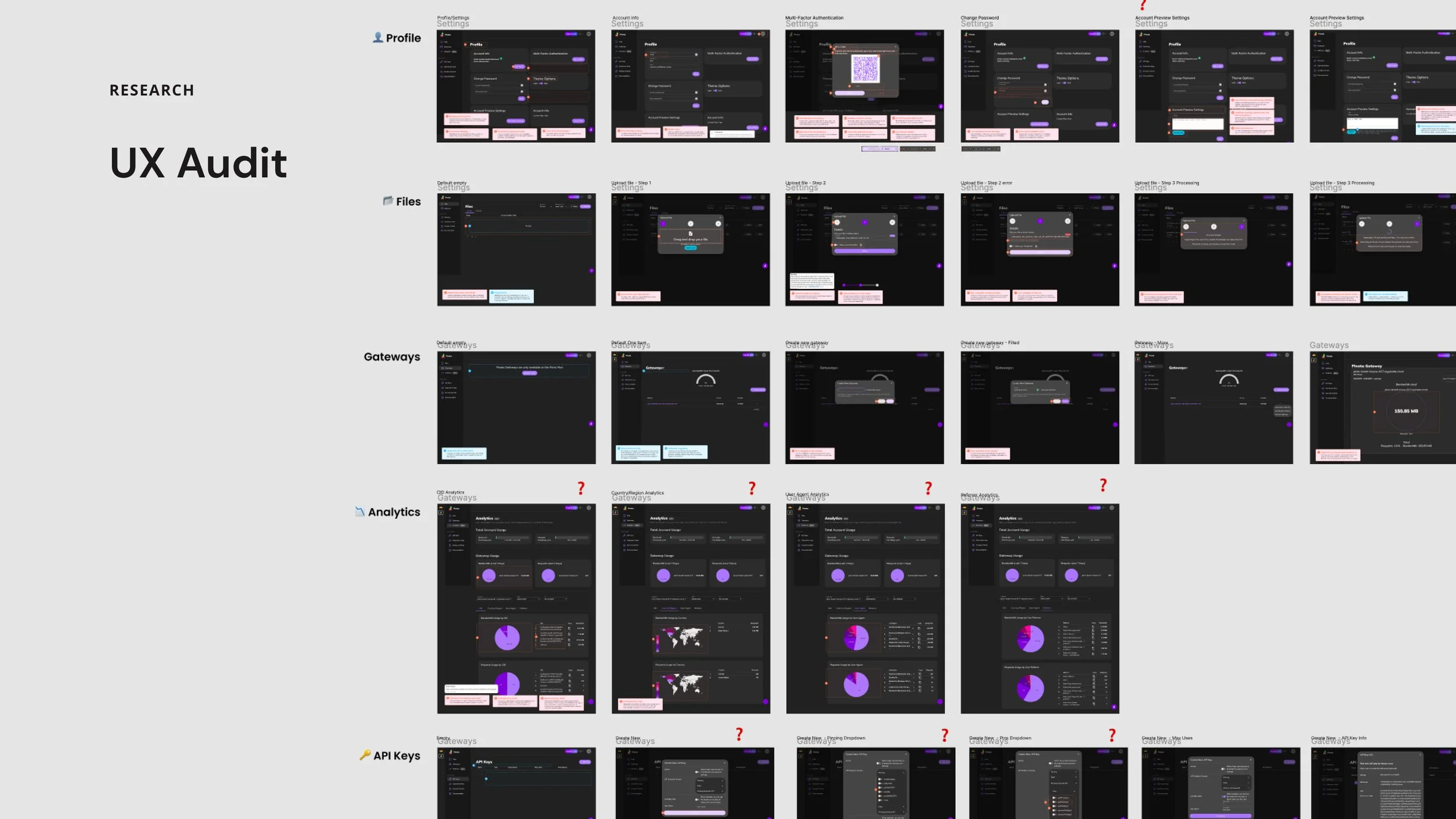
I went page by page through the whole web app, around eighty distinct interactions across Profile, Files, Gateways, Analytics and API Keys, annotating every friction point against Nielsen's usability heuristics and rating its severity from 0 to 4, rather than sampling the flows I assumed were worst.
This was deliberate and expensive. A sampled audit would have been faster, but with a distributed team and limited engineering hours I needed prioritisation to be a conversation about severity scores rather than opinions. It is also how the billing pattern surfaced. No single flow was broken enough to notice on its own.
The recordings made the audit concrete. People rage-clicked the upload area because it looked like a file picker and wasn't one. Files uploaded under the Private tab weren't private unless a separate toggle was on, a trust failure hiding in a layout decision. Upload status messages flashed past faster than anyone could read them, and disabled buttons and a thin display weight failed on contrast and legibility.
02The bill was the design problem
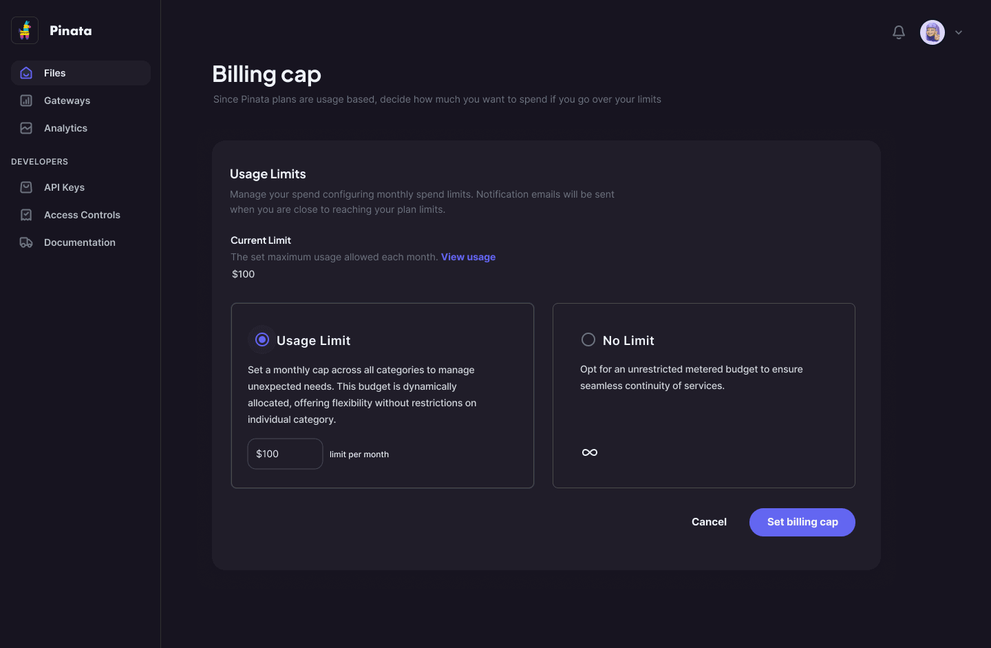
A three thousand dollar surprise is not solved by explaining the invoice better. It is solved by making usage visible while it accrues, and by letting someone put a ceiling on it before it happens.
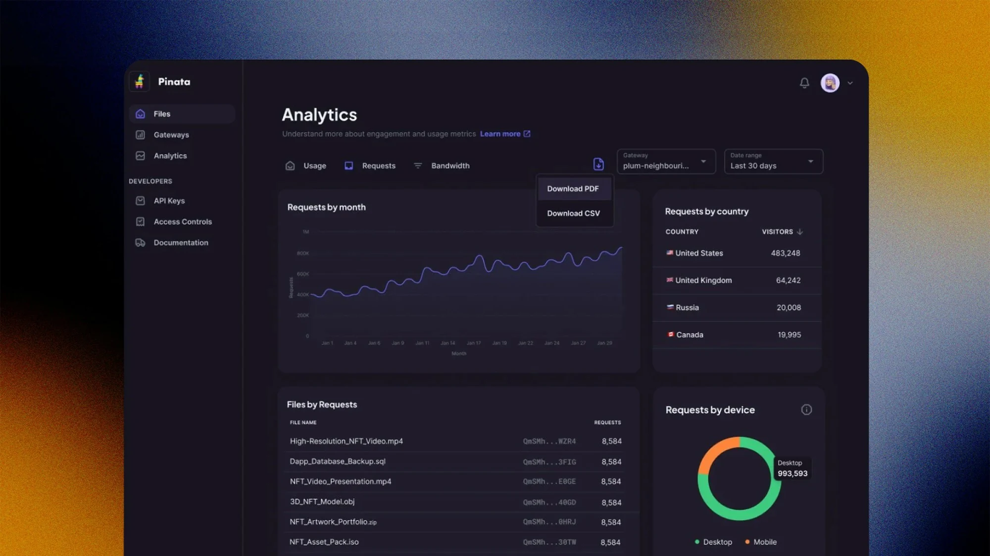
Analytics answers both halves of the question users were actually asking. Usage, so you can see storage, bandwidth and requests against your plan while there is still time to act. And traffic, so you can see which files and which referrers are generating the cost. A number you cannot attribute is not an explanation.
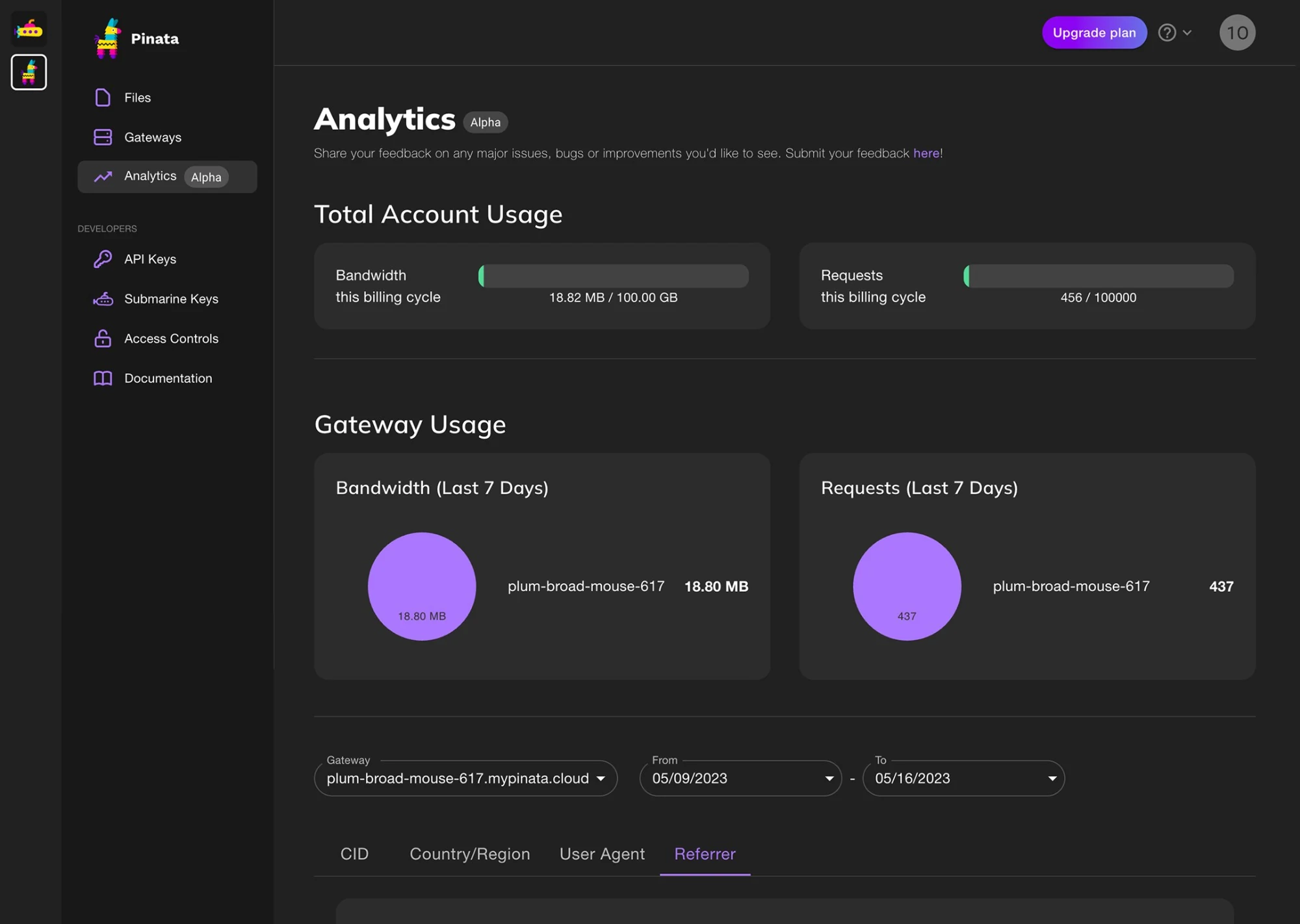
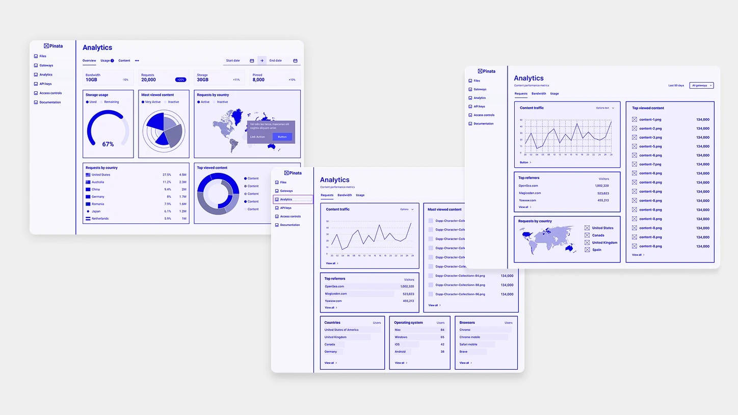
The explorations were tested against each other. The structure that won put data at a glance and let people rank where their traffic came from, down to device and browser, which is the question that turns a usage number into something you can act on.
Then the ceiling. A monthly cap, set by the user, on a usage-based plan. It costs the business the occasional overage and it removes the single worst experience the product could produce. A customer who has been frightened once by a bill does not stay for the roadmap.
03Let people clean up after themselves
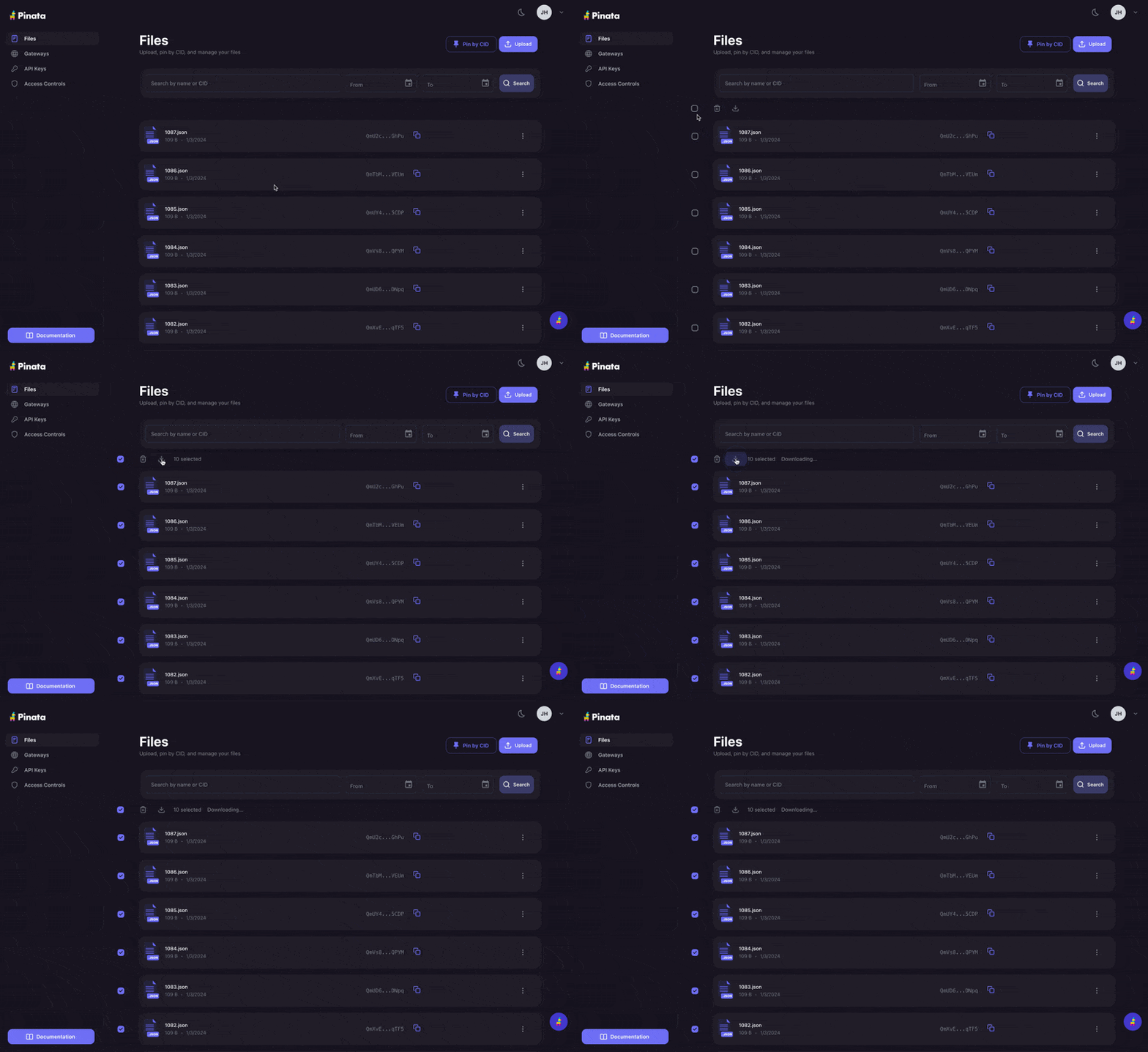
Deletion was one file at a time. Support flagged it as a recurring complaint, and the churn logic is direct: if freeing space is tedious and storage is what you pay for, the rational move is to leave for a competitor where it is not. Bulk operations were a retention feature wearing the costume of a convenience feature.
The obvious answer is persistent checkboxes and a selection toolbar. I refused it. The file list was already dense with CIDs, timestamps and gateway state, and a permanent selection layer makes the common case, scanning for one file, worse in order to serve the occasional case of deleting forty. Hover-triggered actions with progressive disclosure instead.
The cost is real. It is weaker on touch and weaker for discoverability, since a user who never hovers never learns bulk actions exist. We accepted that because usage was overwhelmingly desktop, and because the users feeling the pain hardest were the heaviest and most engaged ones.
04A library you could actually search
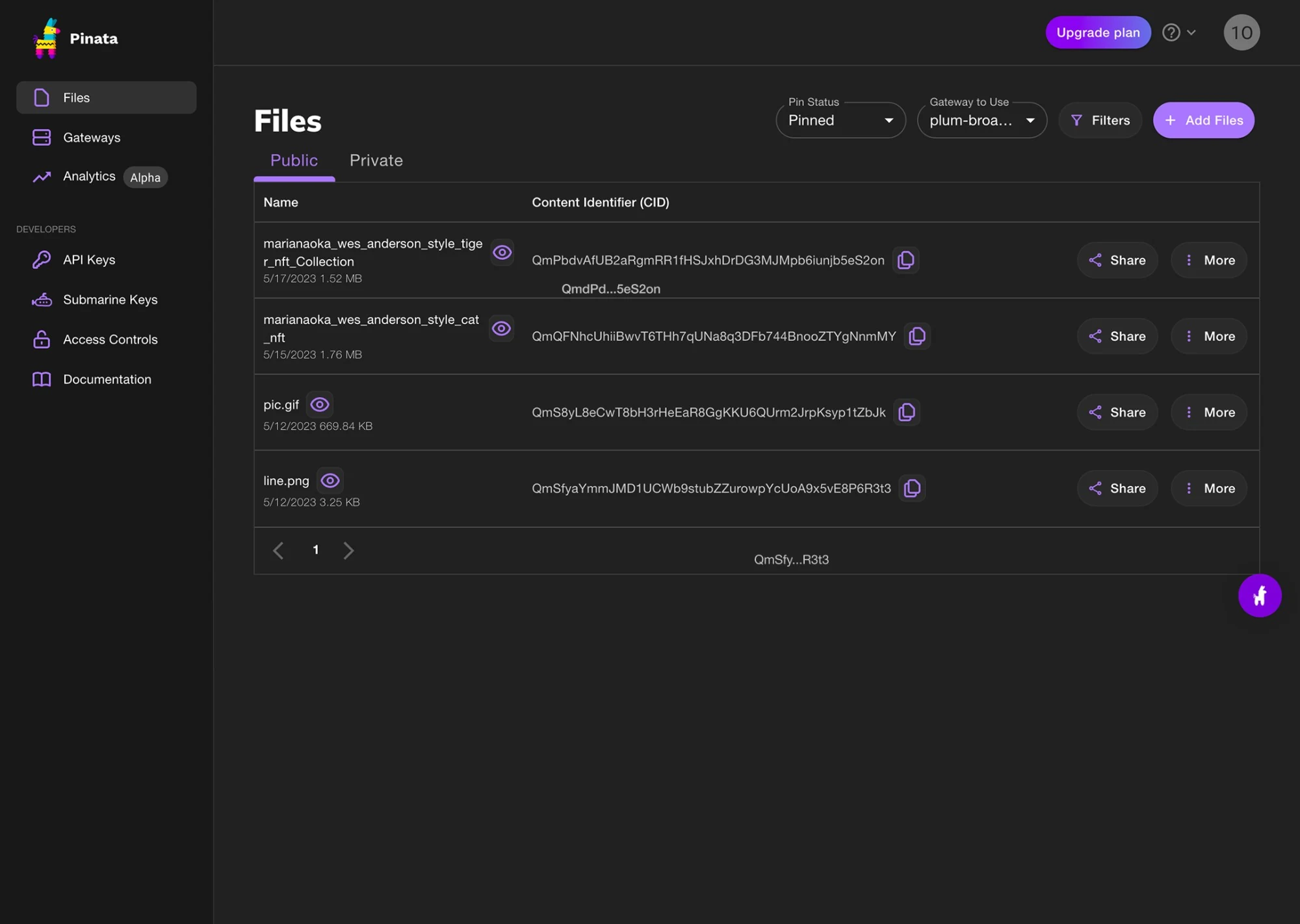
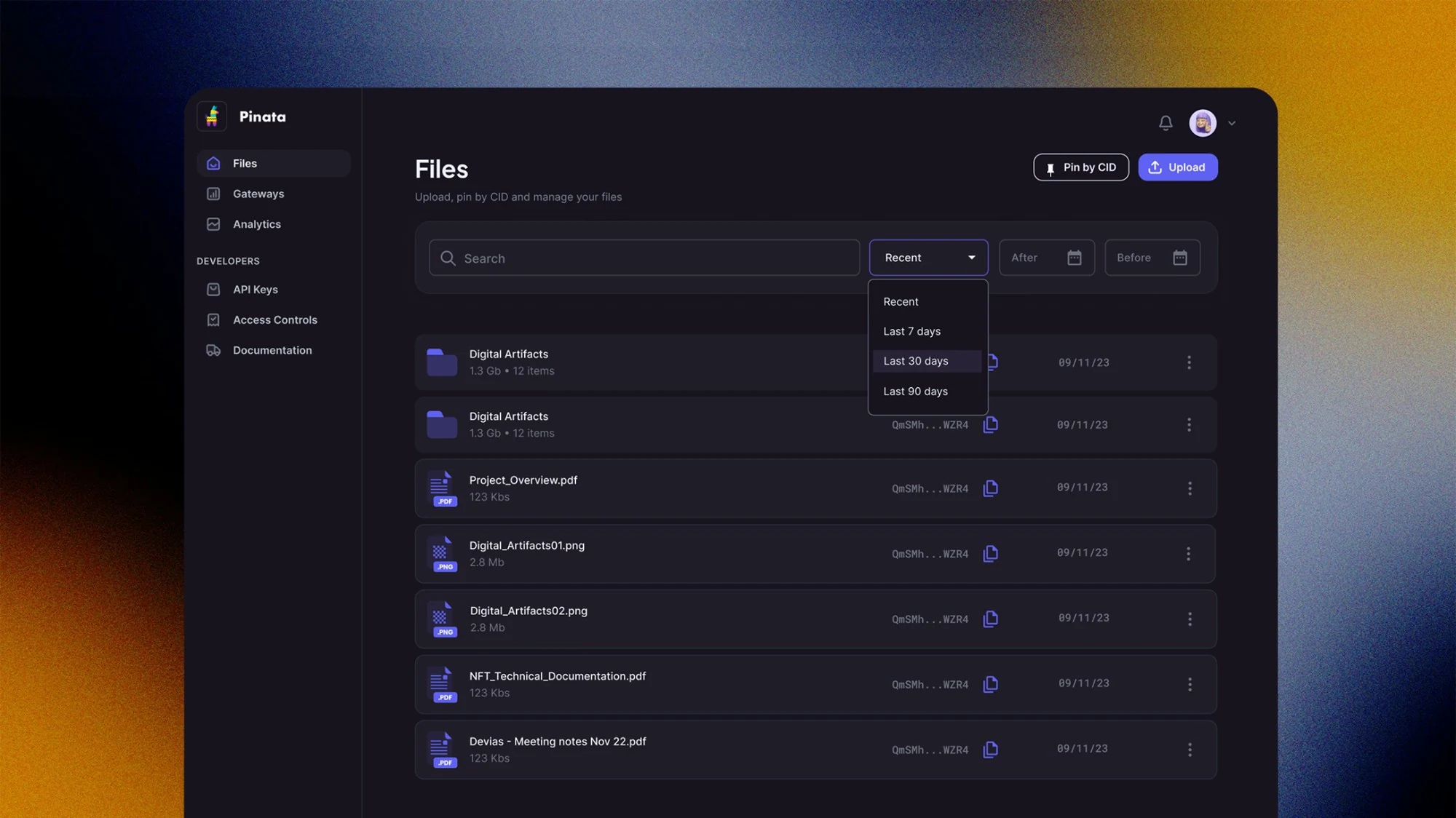
The file list had no way to tell an image from a video from a JSON blob, and no way to search or filter. At a handful of files that is untidy. At several thousand it means the only way to find something is to remember where it was.
File type moved into the row itself, search and date filtering went in above it, and file names got priority over content identifiers. That last one was the interesting call. CIDs are the canonical reference, so the instinct is to show them in full. But nobody reads a CID, they copy it. Giving it a copy affordance and a truncation freed the horizontal space that file names actually needed.
05Red was making deletion more likely
The audit found destructive icons coloured red to warn users, which drew the eye straight to the thing they least wanted to hit. The colour chosen to prevent accidental deletion was increasing its odds.
A finding like that is why the exhaustive audit was worth its cost. It does not show up in a flow diagram or a usability session. It surfaces when someone looks at every screen and asks what each choice is actually doing.
06The real constraint was vocabulary
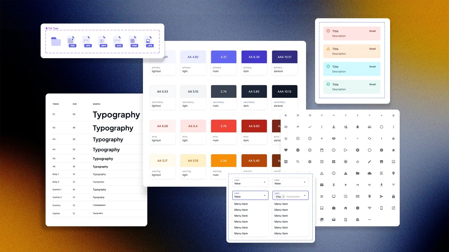
Components were rebuilt from scratch each time and patterns redrawn in every mockup. I built a component library with tokens for typography, colour, spacing and interaction patterns, plus documentation and implementation guidelines. The first component was the modal dialog, because the audit had found dialogs of every length and behaviour across the product, and a standard one could cap how much any dialog was allowed to say.
Development ran roughly 70% faster once those components existed. The saving was not in the drawing. It was in everything that used to happen around it: the decisions that got re-litigated on every screen, the engineering questions that came back because a spacing value was ambiguous, the review cycles spent on things that should never have been in question. A distributed team across time zones pays that tax at every handoff, and a shared vocabulary is what removes it.
A design system is not a drawing aid. It is a decision cache, and the value is in how many arguments you stop having.
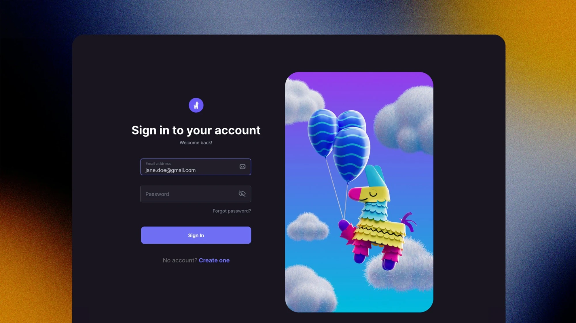
07The container had never fit the content
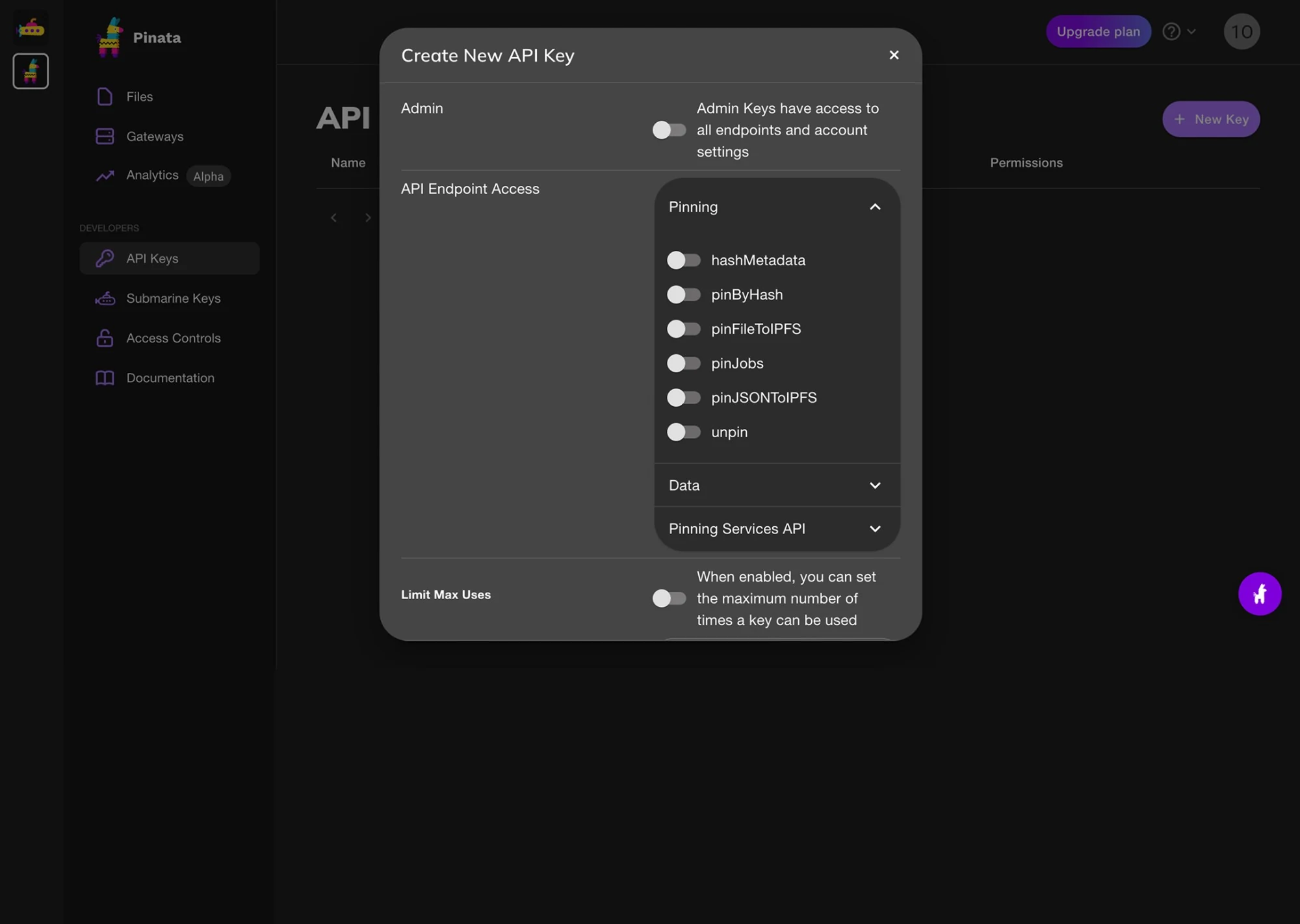
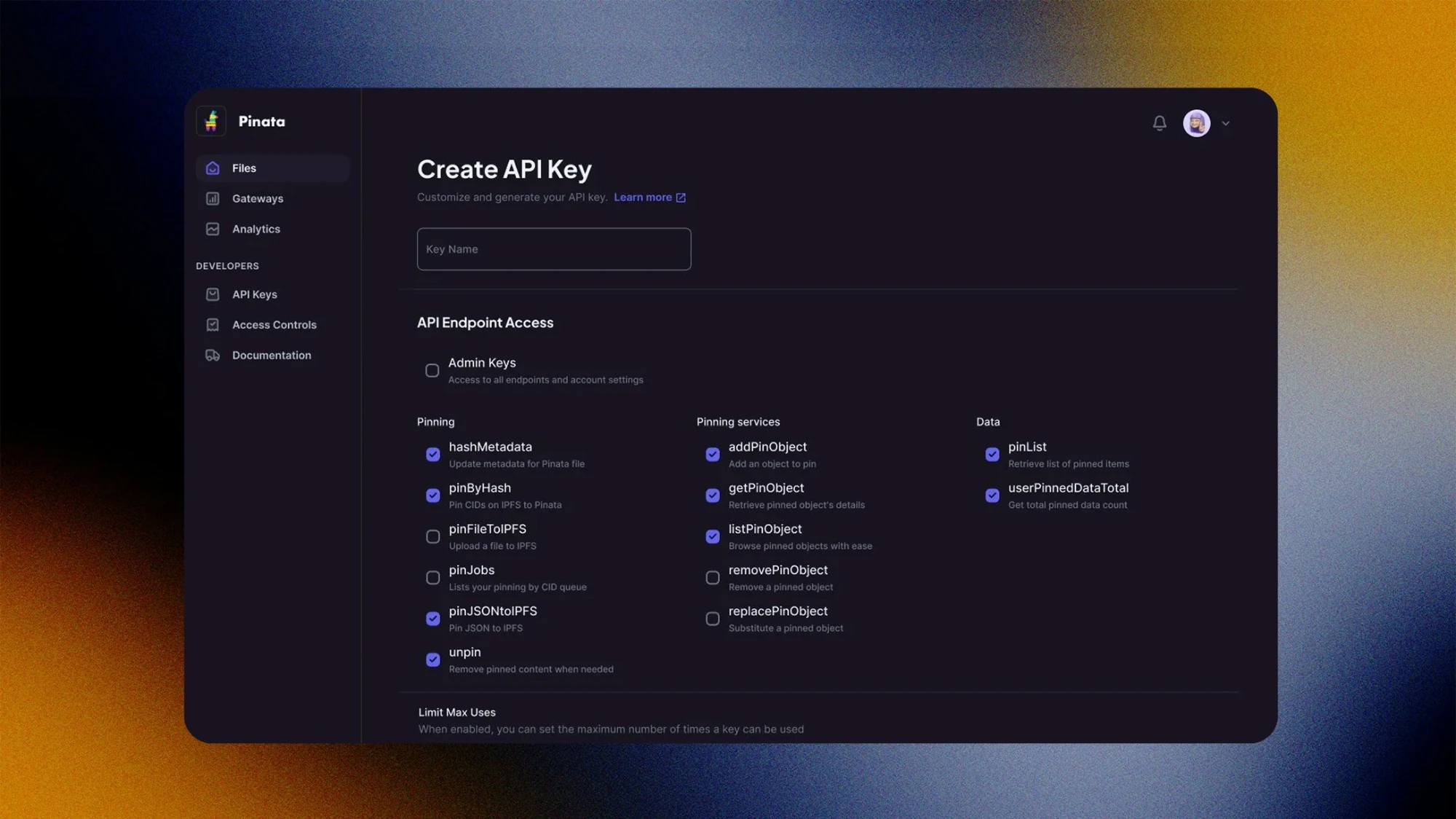
The Create API Key flow was the clearest case. It had been a lightbox, which meant a permissions matrix with dozens of scopes was being navigated through a window too small to show it, with the last row clipped by the modal edge.
Moving it to a full page and grouping endpoints by domain was less a redesign than an admission. The other half was vocabulary: every scope got a line saying what it does, so choosing permissions stopped requiring you to already know what pinByHash meant.
What I would do differently
The billing shock was the most urgent problem, and the spend cap is the least visual thing I shipped. I'd ship it first, in week one, then do the redesign around it.
Reflection
The ticket queue was the research. Nobody needed a study to find the problem. Someone needed to read what users were already telling support. The 60% drop is the same insight measured twice: the tickets told us what to fix, then told us it was fixed.
The most valuable thing I shipped was a spending cap, which is the least designerly artefact in the project. It has no interaction worth showing and it removed the single experience most likely to lose a customer permanently. Not every important decision produces a portfolio image.
Progressive disclosure has a discoverability cost and it should be paid consciously. It was right here because the platform was desktop-dominant. On a touch-first product I would have made a different call.
Decentralised storage in 2023 had the same property agents have now. No conventions to inherit, so every decision had to be argued from first principles instead of looked up. Content identifiers had no interface precedent. Neither does an agent that acts on your behalf and is occasionally wrong. That is why this project and the agent work sit closer together than the subject matter suggests.