04 / LIBRESTREAM
2021 to 2022
Librestream
Turning recorded field-service calls into something a manager can act on
- FOR
- Operations managers and directors at industrial companies, overseeing a workforce of field technicians.
- ROLE
- Product designer and QA tester.
- TEAM
- Two machine learning researchers, one full-stack developer, one product owner, and me.
- TIMELINE
- Eight weeks.
- TOOLS
- Figma, Adobe XD, Pendo, Hotjar, Mailchimp, Zoom, Notion.
- OUTCOME
- 70% of customers approached for the beta opted in. 65% said they would pay more for it.
Impact
BETA PROGRAMME
Customers found real patterns in their own data before the beta was over.
THE NUMBER I WOULD DEFEND
12%
spotted trends around specific parts worth investigating, during the beta
Opt-in measures curiosity and willingness to pay measures intent. A customer finding a real pattern in their own data is the product doing its actual job, unprompted.
BETA COHORT
70%
of customers approached opted in to the beta
65%
said they would pay more for it
And that it would significantly improve their workforce operations.
Introduction
Onsight is remote assistance for industrial work. An expert joins a technician's video call and helps them fix the thing in front of them. Call Insights reads the recordings of those calls and turns them into something a manager can act on: sentiment, recurring topics, summaries, and the named entities that keep coming up.
Problem statement
Operations managers had thousands of recorded field-service calls and no way to see a pattern above a single call, so a recurring fault kept arriving as a string of isolated incidents.
The organisation already had the data and no way to look at it above the level of a single call. A manager could watch one recording. Nobody could answer whether the same part had failed eleven times this quarter.
Every call was handled as a one-off. Each was a record of what broke, what was tried and whether it worked, but nothing connected one call to the next. So a recurring fault arrived as a string of isolated incidents, and the pattern that could have prevented the next one stayed buried in the recordings.
THE PROBLEM
439 calls about one cause, handled as 439 separate incidents.
What I looked at
I started with a competitive analysis of how existing call analysis platforms visualised their data. There were plenty of them. None covered what our customers needed end to end, and more usefully, most of them were close to unusable. The analysis was capable and the interfaces were so dense that managers spent more time navigating the tool than learning anything from it.
The gap in that market was not capability. It was that nobody had made the capability legible to the person who had to act on it.
That set the priority for the whole project. I ran ten interviews over Zoom with managers and directors running operations, alongside fifty survey responses through Mailchimp, and synthesised them into a persona and an empathy map. The pattern was consistent: they were not short of data, they were short of a way to see the shape of it. They needed to spot a trend, not read a transcript.
What I was trying to do
Make a machine's reading of a workforce useful to a manager without making it authoritative. Every derived claim had to stay close enough to its evidence that a person could check it, and the interface had to be readable by someone who had never used an analytics tool and did not want to learn one.
I wrote the bet down as a hypothesis before any screen existed: applying natural language processing to support-call transcripts would give operations managers insight they could act on, because sentiment and recurring topics turn thousands of calls into something a person can read. User stories built on that hypothesis set the scope and the order features were built in.
The decisions
01I learned enough machine learning to argue with the researchers
I took Duke's Introduction to Machine Learning through Coursera partway through the project. Not to build anything, but so I could tell the difference between a feature the models could support and one I was inventing.
The platform was being designed while the capability underneath it was still being established. There were long stretches of investigation to find out whether something was even feasible. A designer who cannot participate in that conversation ends up drawing interfaces for capabilities that do not exist, and then negotiating them away one at a time. Being able to read what the researchers were doing meant proposals arrived already scoped to what was real. Diarization, telling one speaker from another in a recording, was the clearest case: a capability we were still learning while I designed the transcript on top of it.
On a team building something that has not been built before, the designer's job includes learning enough of the adjacent discipline to be wrong in useful ways rather than expensive ones.
02Three levels, because one view cannot serve both questions
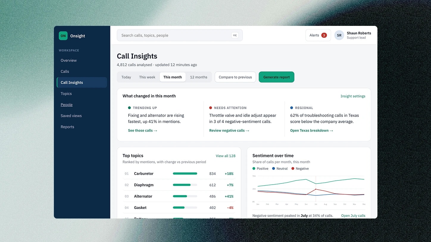
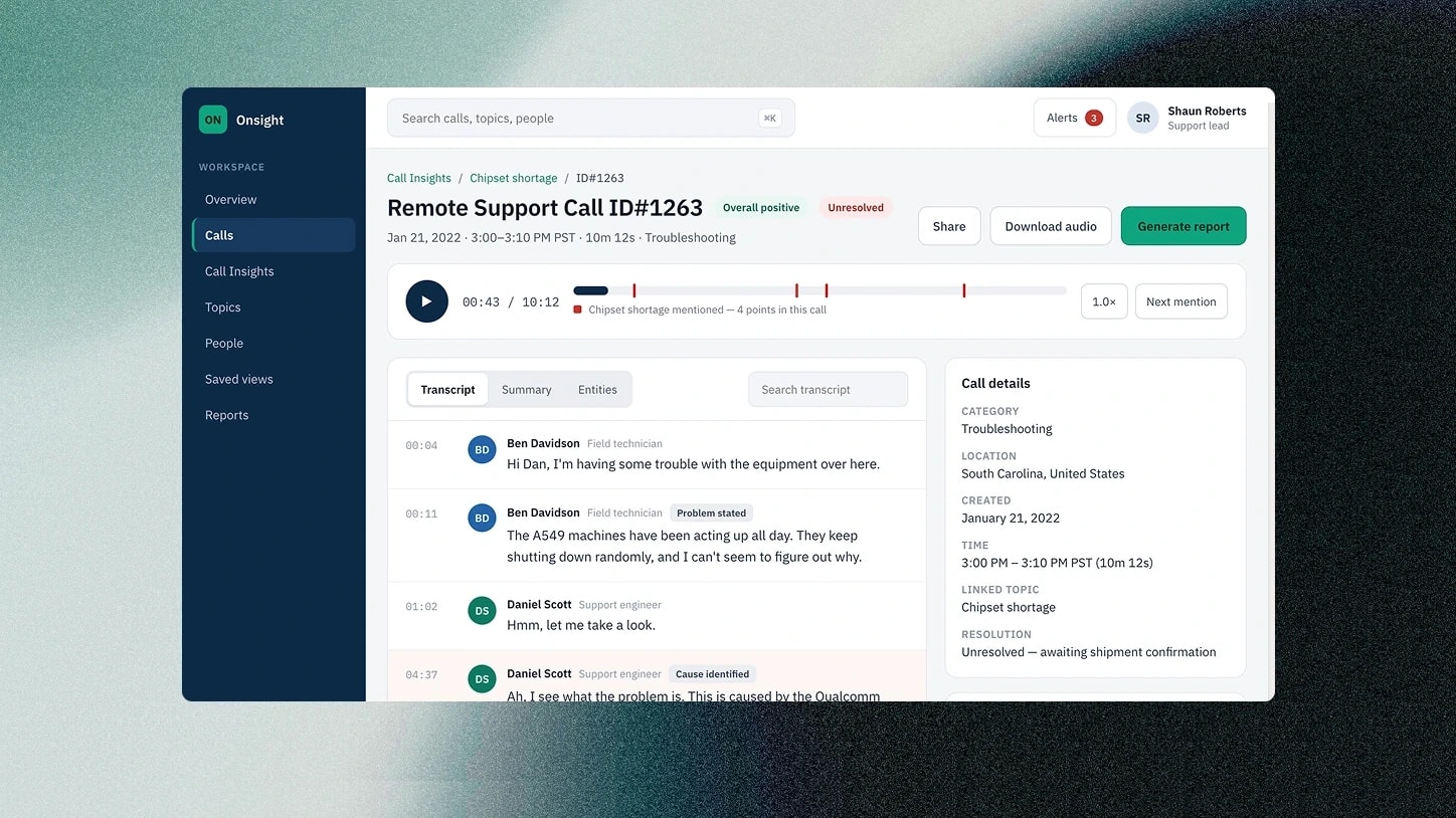
The product resolves into three screens and the split is the design. A dashboard for the pattern across all calls. A topic deep dive for one recurring theme. A transcript for the single call where you need the actual words.
Managers arrive with two incompatible questions: what is going on across my operation, and what exactly happened on Tuesday. A single view answering both would have served neither. Each level drills into the one below it, so a conclusion is always one click from the material it came from.
FIG 03 2 IMAGES, SWIPE OR USE THE ARROWS
01 / 02
FIG 03ALevel one. The pattern across every call, ranked and compared to the period before it.
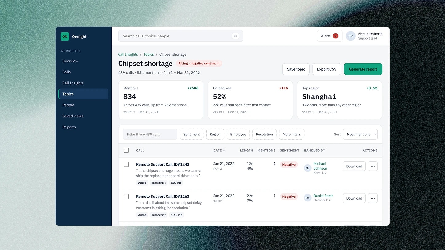
FIG 03BLevel two. One topic, with the calls it came from listed underneath rather than summarised away.
03The transcript is the receipt
Sentiment analysis on your own workforce is a serious thing to put in a product. A summary saying morale is declining on the night shift is a conclusion about people, generated by a model, handed to someone with authority over them.
So the transcript view carries everything the derived claims were built from: the sentiment reading, both the extractive and abstractive summaries, the custom entities, who was on the call and when. The summary is a convenience. The transcript is the evidence, and the design keeps reminding you which is which.
04Instrumented before launch, not after
We set KPIs at the start and built the measurement in: analytics for engagement, Hotjar for behaviour, Pendo for in-product surveys, interviews alongside, and a cost-benefit analysis against call centre operations.
That is unglamorous and it is the reason there are numbers below rather than impressions. A product that ships without instrumentation can only be defended with anecdote.
Also at Librestream: LibreHack 2022, first place
A 48-hour remote hackathon, with developers I had never worked with, around one question: what could Azure Spatial Anchors do for an industrial workforce? We landed on two uses of the same capability. Navigation, placing arrows through a large, complex facility so a worker reaches the right equipment without asking anyone. And training, anchoring a hologram of a machine in the room so its parts can be walked around and explained.
Forty-eight hours rules out building the real thing, so I prototyped the experience instead: 3D models placed in real rooms with Adobe Aero, composited into the redesigned Onsight mobile interface I had been working on, with a text-to-speech narrator as the guide. The helper character was designed to replace a loading screen with something that explains while you wait. The demos ran on a phone; the interaction was designed to carry to tablets and HoloLens.
We won. The development team also left with a basic working version of Azure Spatial Anchors on HoloLens, and both concepts were taken forward as avenues for the business. One finding shaped the pitch: clients wouldn't need 3D artists to author training, because a photogrammetry app like Polycam can scan real equipment into models.
With more time I would have added switchable captions, since a voice-only guide fails first on a loud factory floor, and layered instructions over the interface rather than beside it.
What I would do differently
Sentiment about a workforce is a serious thing to show a manager. I'd add confidence indicators and a clear "why the model thinks this" view from the start, rather than relying on the transcript alone as the receipt.
Reflection
This was AI product design before the phrase meant anything. Summarisation, sentiment and topic clustering, in an industrial setting, with a model whose limits were real and close. The problems were the ones I still work on now: what a system is allowed to assert, how a person checks it, and what happens to trust when the machine is confidently wrong.
Keeping the evidence one click from the conclusion is the same instinct as an agent that drafts and waits. Neither is about restricting what the machine can do. Both are about refusing to let the person lose their grip on what it actually did.