IPFS Storage Web App
End to end UX/UI redesign of IPFS storage web app including brand new features Workspaces and Analytics
Introduction
Pinata, a pioneering web3 platform in the realm of decentralized data storage, is reshaping the landscape of digital asset management and distribution for IPFS and Farcaster.
Pinata makes it simple to store and retrieve media on IPFS and build social applications.
TEAM STRUCTURE:
1x Senior Product Designer
2x Senior Developers
1x Project Manager
As Pinata, an IPFS (InterPlanetary File System) storage platform, continued to evolve, it encountered significant hurdles that hindered its market positioning and user satisfaction. Chief among these challenges were a surge in support tickets due to a convoluted design and missing features, coupled with a decline in user engagement stemming from the absence of critical functionalities like bulk file deletion.
User Research & Data Analysis
I began by conducting an in-depth analysis of existing user feedback, support tickets, and user behaviour data. This allowed me to refine our user persona and pinpoint key pain points, such as UI confusion and the absence of critical features like batch operations for file management.
Process
1. User Research & Data Analysis
The first phase involved an in-depth analysis of existing user feedback, support tickets, and user behavior data. This helped us refine our user persona as well as identify the main pain points, such as the confusion caused by the UI and the lack of essential features like batch operations for file management.
2. Design Audit
A comprehensive audit of the current design was conducted, assessing usability, accessibility, and overall user experience. This phase highlighted areas for improvement, including navigation, information architecture, and visual hierarchy.

UX Audit & User Testing Analysis
I conducted a thorough page-by-page audit of Pinata's entire web application, systematically identifying usability friction points and inconsistencies that were impacting user experience. This comprehensive review covered every user journey, from onboarding flows to advanced IPFS management features, documenting specific pain points around navigation clarity, information hierarchy, and task completion efficiency.


3. Ideation & Conceptualization
The first step involved mapping out detailed user flows for the core tasks identified during the user research phase. This included paths for uploading files, managing storage, and utilizing the new multiple file deletion feature.
4. Sketching wireframes
With a clear understanding of the user flows, the next step was to sketch wireframes. These wireframes served as the blueprint for the redesigned interface. They were kept intentionally low-fidelity at the beginning to focus on layout, information hierarchy, and navigation structure, without getting distracted by aesthetic details.


Iterative Prototyping & Global Collab
Through rapid wireframing and interactive prototypes each design underwent multiple iterations based on input from engineering, product, and customer success teams across different time zones.
I maintained design consistency across 15+ major interface updates while creating detailed specifications, component documentation, and interactive handoff materials that enabled seamless implementation despite the distributed workflow. This streamlined design-to-development pipeline reduced revision cycles by 60% and ensured pixel-perfect implementation across the entire platform rebuild.


Building a Scalable design system
The system included a complete component library with standardized tokens for typography, color, spacing, and interaction patterns, along with detailed documentation and implementation guidelines. By creating modular, accessible components that could be easily adopted across multiple product surfaces, we reduced development time by 40% while significantly improving visual consistency and user experience quality.


Builk actions
I introduced hover-triggered bulk actions and applied progressive disclosure principles to maintain a sleek user interface while enhancing functionality, which allowed us to present advanced features in a way that keeps the user interface uncluttered and focuses attention where it's needed.

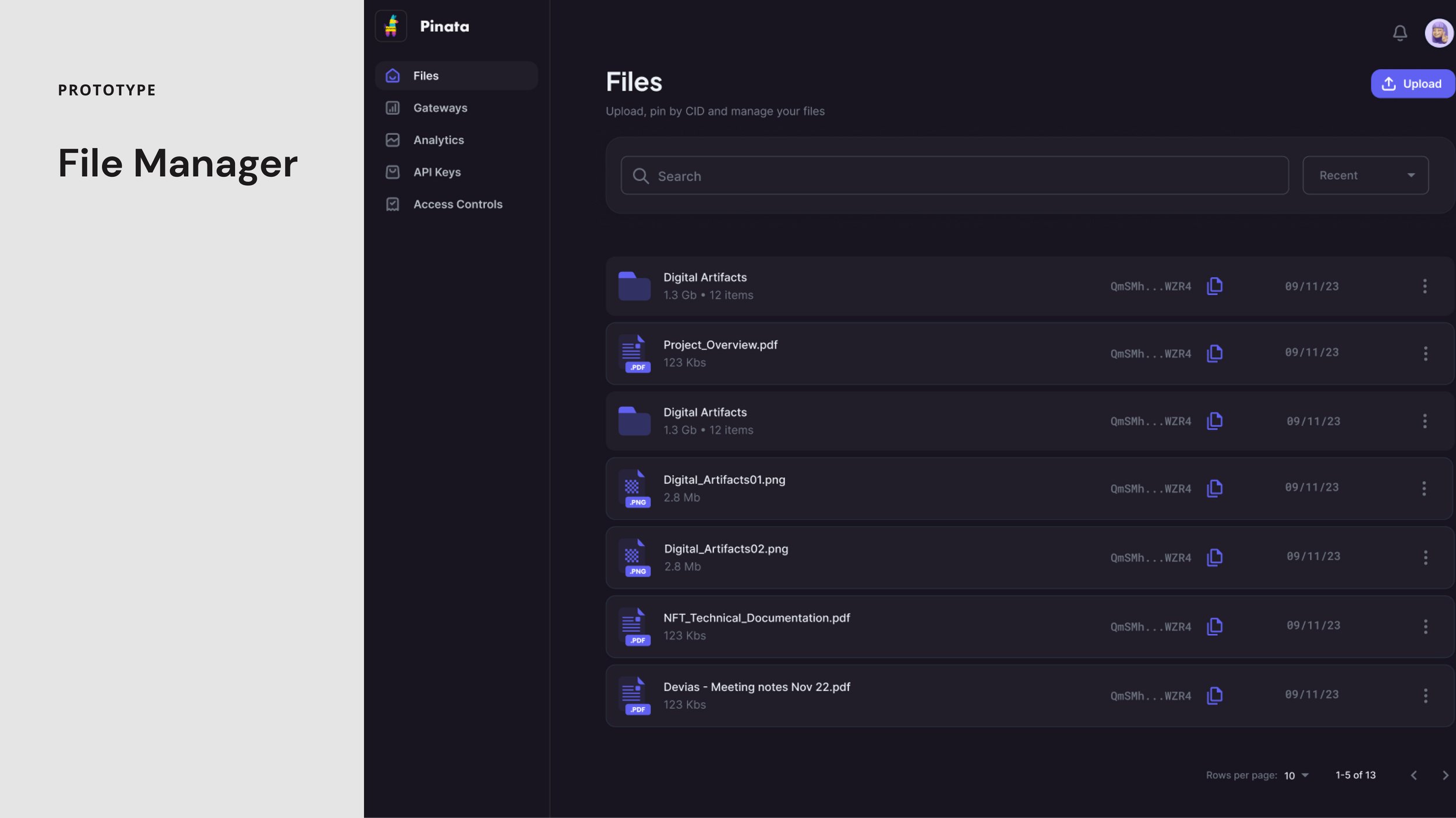
Pin by CID
I crafted a solution to allow multiple CIDs to be added at once, streamlining the workflow for our users. This design shift from single to multiple entries not only enhances efficiency but also broadens the app's appeal, marrying technical need with user-friendly design.

Improved queue
I refined the Pin by CID process, integrating a streamlined queue that's visible only when needed. This design reduces screen clutter and maintains a clean interface, improving usability without sacrificing function. I

API Creation Flow
I updated the API key generation flow, enhancing user engagement through clear, intuitive UX writing and a sleek, full-page layout, moving away from the restrictive modal format. This streamlined approach not only elevates the user experience but also aligns seamlessly with modern design standards.
